Posted on
August 18, 2025
I’ve been putting more and more time into clawdio, a JavaScript library for creating audio effects with WASM. It’s been a great learning experience about audio, digital signal processing (or DSP), and modern tech like Web Assembly.
As I’ve been creating different audio effects, like pink noise, I’ve been doing a lot of signal math. And as much as I love doing math, I prefer being able to visualize it while I’m working on it.
I already have low level validation tests for the signal math, but it got me thinking — why not have visual testing? We could generate the pink noise - then render the waveform like we would on a canvas in the web - but natively in Rust.
In this blog I’ll go over the process of adding visual testing to a Rust library, and little tricks I found along the way.
Why visual testing?
In signal processing (whether it’s audio or electrical engineering), part of testing involves visualization techniques.
That’s why you often see audio associated with a squiggly “waveform” line or shape — it’s a way to take audio data and interpret it into essentially a chart. For the waveform, we’re often seeing a graph of frequency over time.
To visualize the signal math I was doing in Rust, I had to create a test app that imports the clawdio library, generates an audio signal, applies the effect, then finally draws the waveform on a canvas.
This is a lengthy process for testing. It requires building the Rust code to WASM, then building the clawdio TypeScript library, then finally running the test app and pressing a button to play the music.
Instead, what if we could just run a single command line function while we’re writing Rust code, and have it generate a waveform based on the Rust code’s output? That’d simplify things a bit.
Validation
Another reason we test is to validate things even work, or work like they did before and haven’t changed. In a big project it’s easy to change one line of code that effects several other functions, which can lead to unintentional bug-ridden ripple effects.
With most testing it’s easy to validate, because you’re just checking code. Did this number equal the number I expected? Or did this object return the properties I need? Easy stuff.
But what if we need to check visual information? In UI, we have a form of visual testing where the UI code is run in a headless browser. This renders the UI and generates an image (or “snapshot”) of it (kinda like running it ourselves and screenshotting the browser). Then if the UI changes over time, they can track changes by comparing the images.
📁 Check out the Storybook docs for some examples of the process and how it looks.
It’s a great technique for tracking changes in your code visually - like seeing a button grow in size because of a larger padding.
Similarly, what if we could track if our audio wave changes in any way? The numbers would also tell the tale, but it’d be nice to see things as well.
How does audio work?
I’ve covered this topic in a few previous blogs, I highly recommend checking them out.
To summarize them a bit, when we think of audio it’s usually sound or noise. But when we need to represent audio on a computer we need to convert the sound to “data”. The data is basically 1’s and 0’s that represent the “frequency” of our audio (aka what “piano note” is played) among other factors like how “loud” it is.
When we process audio in with clawdio, it’s taking 1’s and 0’s and changing them somehow. For example, I could multiply all of them by 0.5 to lower the volume a bit.
Then it gets even more interesting when I talk about audio waveforms (the squiggly line shape we see visually as audio). This is taking audio data and interpreting it in different ways, usually running the data through an algorithm called FFT to focus on the frequency. Then we can take that frequency data and render it as a waveform.
📁 Learn more about audio waveform visualizations in this MDN documentation.
Rendering the waveform
First, let’s figure out how to render our waveform using Rust. Ideally we want to generate an image file that has a visual representation of our audio data as a line on our canvas.
It’ll technically be a chart if you think about it. We’re visualizing data that’s audio frequency over time. The line travels from left to right (representing time), and moves up and down as it goes across (representing the frequency or “pitch” of the audio). So we could use a library that specializes in making data visualization like charts.
And since our audio data is fairly uniform (we only generate numbers between -1 and 1), the graph can be will be the same structure across all tests.
I ended up using the plotters crate to make a chart with a line graph that mapped out the audio signal like a standard waveform you’re used to seeing normally (a line going from left to right, moving up and down to depict noise).
use plotters::prelude::*;
// Plotting function
pub fn plot_waveform(
samples: &[f32],
sample_rate: f32,
filename: &str,
title: &str,
) -> Result<(), Box<dyn std::error::Error>> {
// Create the backend for drawing
let root = BitMapBackend::new(filename, (800, 600)).into_drawing_area();
root.fill(&WHITE)?;
// Map samples to a linear graph where horizontal is time (aka duration)
let duration = samples.len() as f64 / sample_rate as f64;
let time_points: Vec<(f64, f64)> = samples
.iter()
.enumerate()
.map(|(i, &sample)| (i as f64 / sample_rate as f64, sample as f64))
.collect();
// Build the chart
let font = ("sans-serif", 40).into_font();
let mut chart = ChartBuilder::on(&root)
.caption(title, font)
.margin(20)
.x_label_area_size(40)
.y_label_area_size(40)
.build_cartesian_2d(0.0..duration, -1.5..1.5)?;
chart
.configure_mesh()
.x_desc("Time (s)")
.y_desc("Amplitude")
.draw()?;
// Plot points on graph/chart
chart.draw_series(LineSeries::new(time_points, &BLUE))?;
root.present()?;
Ok(())
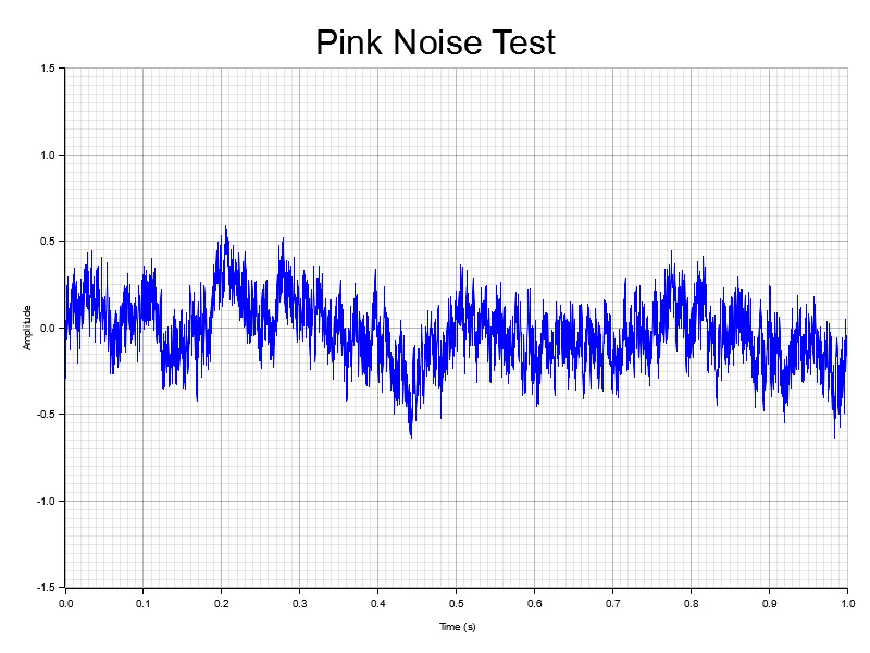
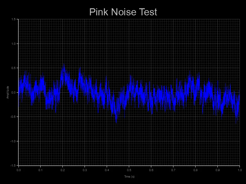
}With this function, we can call it inside our existing tests. The test generates mock audio data and runs the specific effect (in this case Pink Noise).
use clawdio_pink_noise::PinkNoiseModule;
use test_helpers::plotting::plot_waveform;

const NUM_SAMPLES: i32 = 4096;

/**
 * Check if signal is created
 */
#[test]
fn test_signal() {
    let mut filter = PinkNoiseModule::new(NUM_SAMPLES);

    // Run the filter process
    let result = filter.process_vec();

    // Output should be close to zero for zero input
    for sample in &result {
        assert!(sample.abs() != 0.0, "Shouldn't be zero: {}", sample);
    }

    // Visualize signal
    plot_waveform(
        &result,
        NUM_SAMPLES as f32,
        "Pink Noise Test",
    )
    .expect("Failed to create sine wave plot");
}
Using the same mock sample data, we just pass it into the plotting function and it maps the chart accordingly.
And with that, when we run cargo test, our tests all run and we also generate a pretty nice looking waveform based on our mock audio data:
Visual testing crate
Now that we have a function to plot our waveform data we need to share it across other tests.
We already have a shared “testing utilities” crate that holds any functions used by multiple effects, so I figured that’d be a great place. I made a new module (aka mod) inside of there to handle plotting.
And I know that the plotters crate we’re using for testing will probably be large, so I’ll add a feature flag called viz to enable it optionally. That way some tests theoretically compile and run faster.
// clawdio/modules/test-helpers/src/plotting.rs
#[cfg(feature = "viz")]
use plotters::prelude::*;

// Plotting function
#[cfg(feature = "viz")]
pub fn plot_waveform(
    samples: &[f32],

    sample_rate: f32,
    filename: &str,
    title: &str,
) -> Result<(), Box<dyn std::error::Error>> {

    let root = BitMapBackend::new(filename, (800, 600)).into_drawing_area();
    root.fill(&WHITE)?;

    let duration = samples.len() as f64 / sample_rate as f64;
    let time_points: Vec<(f64, f64)> = samples
        .iter()
        .enumerate()
        .map(|(i, &sample)| (i as f64 / sample_rate as f64, sample as f64))
        .collect();

    let mut chart = ChartBuilder::on(&root)
        .caption(title, ("sans-serif", 40).into_font())
        .margin(20)
        .x_label_area_size(40)
        .y_label_area_size(40)
        .build_cartesian_2d(0.0..duration, -1.5..1.5)?;

    chart
        .configure_mesh()
        .x_desc("Time (s)")
        .y_desc("Amplitude")
        .draw()?;

    chart.draw_series(LineSeries::new(time_points, &BLUE))?;

    root.present()?;
    Ok(())
}
Then in our shared testing crate’s main lib.rs we export it:
// clawdio/modules/test-helpers/src/lib.rs
#[cfg(any(test, feature = "viz"))]
pub mod plotting;

// Any other exported code
And finally in our shared crate’s Cargo.toml we can add the plotters crate as an optional dependency. I tried making it purely a dev dependency but the way Rust works when you import another crate inside another, it doesn’t import any dev dependencies. Which kinda makes sense. So we have to make it a dependency to ensure it actually gets exported/imported properly.
[dependencies]
plotters = {version = "0.3.7", optional = true}

[dev-dependencies]
plotters = "0.3.7"

[features]
viz = ["plotters"]
So now when I want to use visual testing in another crate (like one of our effects), I can update it’s Cargo.toml and add the viz feature:
# inside modules/pink-noise/
[dev-dependencies]
test-helpers = { path = "../test-helpers", features = ["viz"] }
Comparison tests
Seeing the final, effected audio wave is cool - but what if we could see the original audio wave stacked on top too? It’d help visualize the actual effect and show something is happening.
This one was fairly simple to setup. We just take in the “original” audio data, as well as the effected data we’ve already been using. Then chart both simultaneously and labeling each a unique color.
#[cfg(feature = "viz")]
pub fn plot_waveform_comparison(
    samples: &[f32],
    samples_compare: &[f32],

    sample_rate: f32,
    title: &str,
) -> Result<(), Box<dyn std::error::Error>> {

		// Condensed a bit

		// Convert our data to chart points
    let time_points: Vec<(f64, f64)> = samples
        .iter()
        .enumerate()
        .map(|(i, &sample)| (i as f64 / sample_rate as f64, sample as f64))
        .collect();

    let compare_points: Vec<(f64, f64)> = samples_compare
        .iter()
        .enumerate()
        .map(|(i, &sample)| (i as f64 / sample_rate as f64, sample as f64))
        .collect();


    // Plot points on graph/chart + add labels
    chart.draw_series(LineSeries::new(time_points, &BLUE))?.label("Effect")
        .legend(|(x, y)| PathElement::new(vec![(x, y), (x + 20, y)], &BLUE));
    chart.draw_series(LineSeries::new(compare_points, &PURPLE))?.label("Comparison")
        .legend(|(x, y)| PathElement::new(vec![(x, y), (x + 20, y)], &PURPLE));


    // Draw the legend with labels
    let font = create_label_font();
    chart
        .configure_series_labels()
        .background_style(&GREY_900)
        .label_font(font)
        .border_style(&GREY_600)
        .position(SeriesLabelPosition::LowerRight)
        .draw()?;

}
The big difference between this and the last example is the use of legend() on the chart instance when we draw each line. This creates a small box in the corner of the graph that shows each line color and it’s label. We use a PathElement to draw a line (to represent our well…line). They have other classes available, like drawing squares if you want different shapes.
And now we have a chart that has 2 lines stacked, one blue that represents our Bitcrusher effect, and a purple that is the original audio wave.
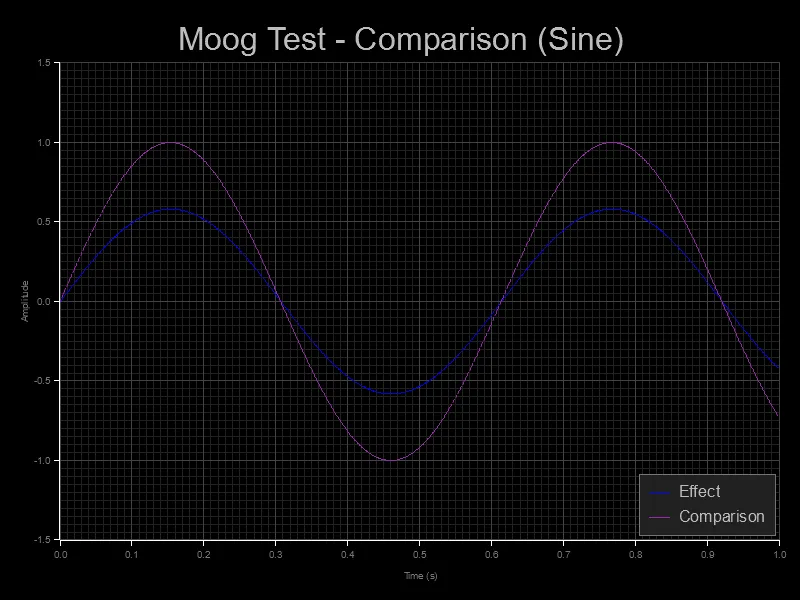
📁 I’ll definitely be revisiting the theming another time to make it more accessible. The currently color combination is a bit hard to see for some users.
Polishing testing
As much as testing is working - we have a few issues. Tests get generated at the root folder of each module, and I want to style them a bit to make them more custom to our library.
Snapshots folder
Needed to save things in a __snapshots__ folder - relative to each module’s test folder (e.g. /modules/pink-noise/tests/__snapshots__/).
📁 I looked up what were the common folders to store test artifacts. Storybook, Jest, and other libraries use the
__snapshots__folder name - so figured it’d be good.
I wrote a quick Rust script to create a new __snapshots__ folder relatively in the test folder.
use std::path::Path;
use std::fs;
const SNAPSHOT_FOLDER_PATH: &'static str = "tests/__snapshots__";

    let snapshot_path = Path::new(SNAPSHOT_FOLDER_PATH);
    if !&snapshot_path.exists() {
        println!("no folder found");

        fs::create_dir(SNAPSHOT_FOLDER_PATH)?;
    }

    // Append filename to the snapshot folder
    let filepath = snapshot_path.clone().join(filename);
    let filepath_string = filepath.to_str().unwrap();
This checks if the path exists and then creates it if not. Nothing too wild (and needs better handling of the unwrap - I got super lazy).
Styling the charts
This was probably the easiest step. The plotters crate makes it pretty simple to style the chart using functions we chain on the chart instance.
use plotters::style::full_palette::{PURPLE, GREY_600, GREY_800, GREY_900};

chart
  .configure_mesh()
  // Style the grid lines
  .light_line_style(&GREY_900)
  .bold_line_style(&GREY_800)
  // Label the axis
  .x_desc("Time (s)")
  .y_desc("Amplitude")
  // Color the outer axis lines
  .axis_style(&WHITE)
  // Axis label color
  .label_style(&GREY_600)
  .draw()?;
To change the background color we’ll need to tap into the root of the BitMapBackend we created originally. I make mine BLACK in this case:
fn create_canvas(filepath_string: &str) -> DrawingArea<plotters::prelude::BitMapBackend<'_>, Shift> {
    let root = BitMapBackend::new(filepath_string, (800, 600)).into_drawing_area();
    root.fill(&BLACK).expect("Couldn't create canvas");

    root
}
I also created some helper functions to generate the font styles for labels and titles to share between different plotting functions:
pub fn create_title_font() -> TextStyle<'static> {
use plotters::style::full_palette::{GREY_400};
    ("sans-serif", 40).into_font().color(&GREY_400)
}

pub fn create_label_font() -> TextStyle<'static> {
use plotters::style::full_palette::{GREY_400};
    ("sans-serif", 20).into_font().color(&GREY_400)
}

// Used later
let font = create_title_font();
let mut chart = ChartBuilder::on(&root)
    .caption(title, font)
And with that we have a nice “dark mode” version of our graph. Looks a bit cooler than the original one.
What’s next?
We have visual testing, and even a way to compare audio waves, but the one key ingredient missing from this test stack is comparing tests when new ones are generated.
You can see it in the Storybook docs, when you test for UI you basically take the old snapshot and new snapshot and overlay them and check for differences. The differences are highlighted in a distinct color (like red), so you can quickly see what areas have changed.
Currently, when we generate tests, it just overrides the previous test. It’d be nice if it kept an old version around, did some sort of comparison, and gave the user a way to see the differences in wave.
Ideally this could be accomplished by rendering a transparent version of our chart (no BG, grid lines, or labels) and stacking the two images, coloring the other a distinct color. This would be the quickest way.
Although the more interesting problem to solve is the interface around it. In Storybook you get well, Storybook - a whole UI to browse the tests and see them. In our case, we just use command lines to run our test. We could just generate additional images, but it requires the user to go find them and open them.
It’d also be nice to run tests without always generating a visualization. Since they override the old version, it’s easy to possibly commit changes and lose track of stuff.
What’cha testing?
I hope this helped get you introduced to the topic of visually testing in Rust and how to quickly start plotting some test data.
If you enjoyed this blog, have any question, or want to share examples of your own visual testing — feel free to hit me up on social platforms. And if you want to support blogs like this, consider contributing to my Patreon.
Stay curious,
Ryo
comments?
what's up?