Posted on
March 28, 2023
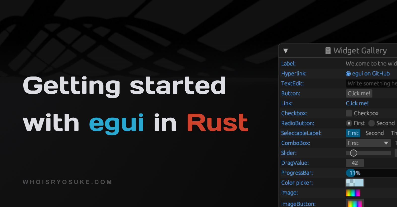
I started to experiment with egui recently, a cross-platform UI library for Rust, to make an IDE for a game engine. It was a great way to dive in and learn how egui works by making a real app. My goal was to try to replicate Unity or Unreal Engine in Rust, using Bevy as my “game engine” and rendering the UI with egui.
An example of the final app I created using egui. The app resembles Unreal Engine with many “sidebar” panels, a window that shows a 3D scene being rendered, and an animation timeline showcasing custom egui components like vertical lines representing blocks of time in the graph, or a square representing an animation clip.
I thought I’d share what I learned as a beginner to egui, like how to use their components, or create your own from scratch. The documentation and examples do a great job of illustrating some broader strokes, but it definitely requires a bit of digging. This should be easier to parse through quickly for tips, kinda like a cheatsheet for egui.
And make sure to stick around to the end - I also provide links to plenty of egui resources that helped me and should guide you on your journey learning.
What is egui?
egui is an immediate mode GUI library for Rust. This means your UI renders every “frame per second”, instead of like the HTML and DOM or ReactJS’s Virtual DOM — which create a virtual “tree” of UI nodes and uses that to update and render more efficiently. It’s similar to imgui, a C++ GUI library used by 3D and game developers.
So why would you want to render UI “immediately”? It’s incredibly useful for debugging purposes and when developing high fidelity products (like a 3D visualization app - you want instant feedback for user input).
What makes egui so versatile is that it’s written on top of WebGPU - which means your UI code can run natively on someone’s PC as a binary bundle or in the browser using WASM.
You can see examples of egui apps here in their showcase thread on Github.
Getting started
Picking a framework
There are a few ways to create an egui app.
- You can use eframe, which is a cross platform framework that helps you write an app that supports native and web. If you were going to do egui alone — this is the officially recommended way to go.
- You can use Tauri, which has an egui integration. Tauri is a cross-platform app framework written in Rust, similar to Electron. Rather than using eframe to handle creating a native window - or binding to the web browser - you could leverage Tauri’s ecosystem.
- You can use Bevy, which also has an egui integration. Bevy is a game engine for Rust that also leverages WebGPU, letting you write games for desktop or web. You’d use this method if you want to integrate 3D graphics into your workflow or create a game. If your goal is only 3D support, you could use eframe instead, which has an example using glow (a Rust implementation of OpenGL). Or you could use three-d (a Rust implementation of ThreeJS).
For my case I used Bevy, it handled the 3D game engine part of my app.
New project
Now let’s get this party started. Let’s make our app and setup Bevy and egui.
- We’ll create a new Rust project:
cargo new bevy-egui-playground - Install Bevy and the egui integration:
cargo add bevy bevy_egui - Then copy over the simplest example code to our
main.rsfile - Try running the app using
cargo runand you should see “world” inside a window.
Breaking down the example
Let’s take a closer look at the example we copied.
fn ui_example_system(mut contexts: EguiContexts) {
    egui::Window::new("Hello").show(contexts.ctx_mut(), |ui| {
        ui.label("world");
    });
}
We can see our function is a “system” - which is what Bevy called functions that run during the game loop. You can also see we have access to a contexts function parameter that contains EguiContexts — which for GUI apps tends to be a place where you can “draw” or “render”.
Inside that we create a new native window and title it “Hello”. We use the window’s .show() method to pass our context to the window, and a “callback function” (or “closure” in Rust) that renders our UI. The callback function has access to a ui property that egui’s helper struct for managing UI. All the egui components are available as methods on ui, like ui.button(). We render a “label” component (basically plain text, like a <p> on web) using ui.label(text).
And that’s about it! They keep it pretty simple. But you can an idea of how to spin up your app and render a component.
📘 Want to learn more about Bevy and how it works? Check out my tutorial on making a Galaga game using Bevy where I break down the Bevy architecture.
Docking example
Since the goal is to make an IDE for a game engine, we want to have a UI that looks similar to those with “sidebars”, “menus”, and “panels” that hold all the buttons and knobs.
egui has a concept of “panels” it uses to create containers for your UI that dock to parts of the screen (like a left sidebar panel).
If you look at the examples for bevy_egui, you’ll see they have a “side panel” example that looks very similar to Unity or Unreal Engine already.
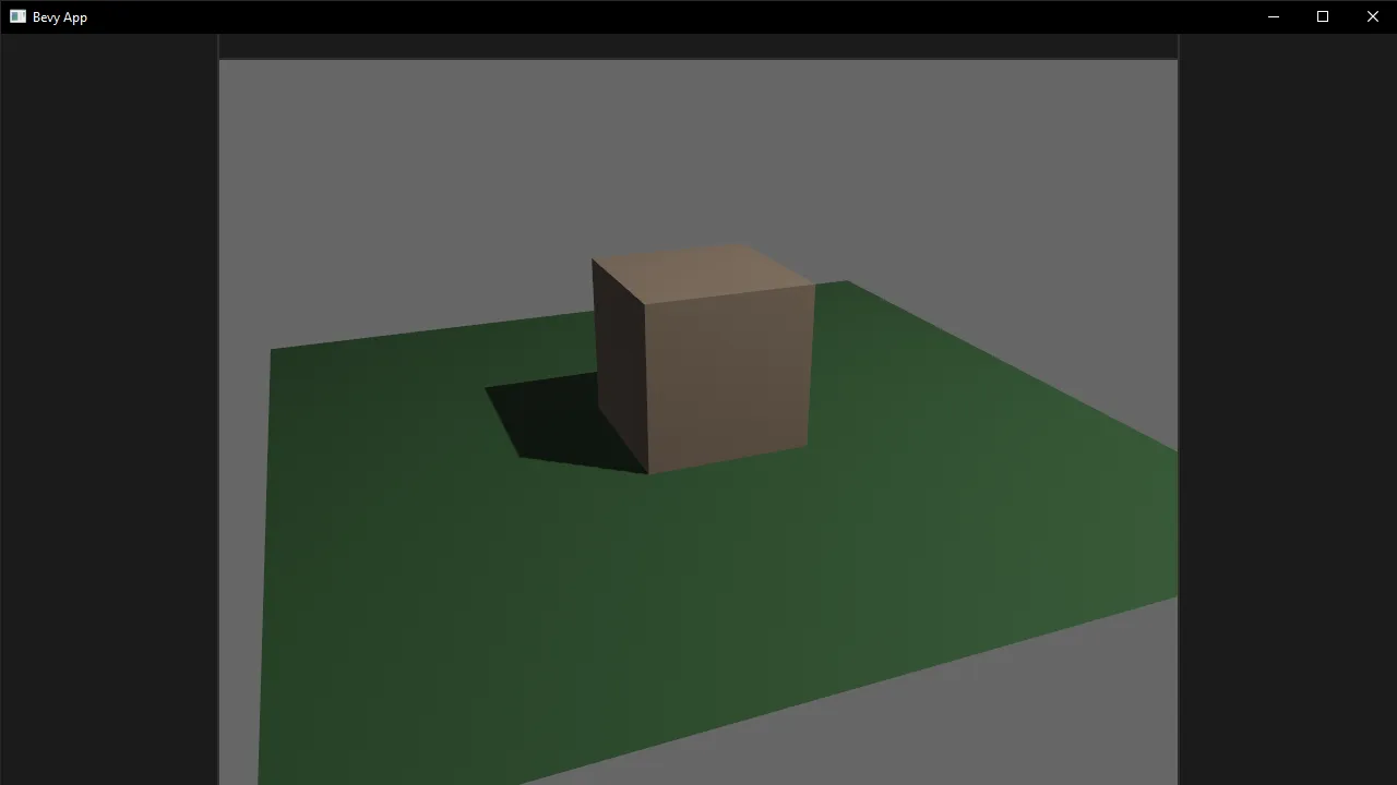
A screenshot of a native Bevy and egui app rendering a UI that resembles a game engine IDE with left and right sidebar panels and a top menu bar. the center of the window is rendering a 3D scene with a brown cube centered with a green sin wave modified plane underneath.
Let’s copy that example over to our main.rs file and use it as the basis for our experiments.
egui basics
Now that we have a sandbox setup for our UI we can start experimenting with the basics of egui, like rendering different components (like a button) - or handling component interactions like click or hover.
Rendering components
From the simple example earlier we got an idea of how to render a Label component (or “Widget” in egui) using the ui struct and the .label() helper method. Taking a look at the Quick Start from the docs, we can see a few more examples of some standard Widgets:
ui.label("This is a label");
ui.hyperlink("https://github.com/emilk/egui");
ui.text_edit_singleline(&mut my_string);
if ui.button("Click me").clicked() { }
ui.add(egui::Slider::new(&mut my_f32, 0.0..=100.0));
ui.add(egui::DragValue::new(&mut my_f32));

ui.checkbox(&mut my_boolean, "Checkbox");

#[derive(PartialEq)]
enum Enum { First, Second, Third }
ui.horizontal(|ui| {
    ui.radio_value(&mut my_enum, Enum::First, "First");
    ui.radio_value(&mut my_enum, Enum::Second, "Second");
    ui.radio_value(&mut my_enum, Enum::Third, "Third");
});

ui.separator();

ui.image(my_image, [640.0, 480.0]);

ui.collapsing("Click to see what is hidden!", |ui| {
    ui.label("Not much, as it turns out");
});
You can find a full list of components here and examples for each component in this file.
Alternative syntax
You could also use the ui.add() method to “add” widgets manually. This is especially useful if you’ve created a custom Widget, and for some egui widgets that don’t have helper methods (like Slider).
You call the ui.add() method and pass in a Widget that’s been initialized. In this case we create a DragValue Widget - which is like a text input that you can click and drag like a slider.
ui.add(
    egui::DragValue::new(your_drag_value)
        .speed(0.1)
        .clamp_range(0..=100),
);
Rendering text
One of the first elements you’ll want to render in your UI is probably text. But you won’t find any ui.text() methods - instead you need to use Label and Hyperlink Widgets. These will be the basis for most text in your app. There are also helper methods to format the text, like Heading, Strong, and Code — which are basically wrappers around the Label Widget with preset formatting applied.
The UI struct provides helper methods to quickly format text the way you need:
ui.label()- Plain and smaller text. Like a<p>on web.ui.heading()- Larger text by default. Technically just a label with different formatting applied. Like a<h1>on the web.ui.strong()- Bold text. Like a<strong>on web.ui.code()- Inline code snippet. Like a<pre>on web.ui.hyperlink()- For text that links to a URL. Like a<a>on web.
You can find a full list of the UI helper methods here.
And here’s an example of few in action:
ui.heading("A heading");
ui.label("This is a label");
ui.strong("Bold text");
ui.hyperlink("https://github.com/emilk/egui", "egui github");
Interaction
So cool, we have components like a button — but how do we handle clicking the button? Or hovering over it?
Since all egui Widgets are essentially function calls, we can save the “result” of calling the function into a variable. That result is a Response — a struct that gives you access to methods like .clicked() or .hovered().
// This stores the button's Response
let button = ui.button("click me");

if button.clicked() {
    click_action();
}

if button.hovered() {
    hover_action();
}

// or shorthand version if you only care about 1 thing
if ui.button("click me").clicked() {
    take_action();
}
You can see an example of interaction here in the docs.
Sense-ing different interactions
But how does the button know what kind of interaction we want? egui uses their Sense struct to define if a Widget can be clicked, dragged, or focused.
For example, here we create a button, and we change the interaction it checks for to “dragging” by using the .sense() method with our Sense struct.
const draggable_button = egui::Button::new("Square").sense(Sense::drag());

// Check if button was dragged
if draggable_button.drag_started() {
	// Do stuff
}
You’ll find yourself also doing this when you create UI containers and want to add interactivity to them too (similar to checking if a <div> has been hovered over or clicked).
// Draw a rectangle that fills the space and check for hover interaction
ui.allocate_rect(ui.available_rect_before_wrap(), egui::Sense::hover());

// Create a "canvas" container to paint Shapes inside of and check for hover
let (response, painter) = ui.allocate_painter(
    bevy_egui::egui::Vec2::new(ui.available_width(), 300.0),
    Sense::hover(),
);
Layout
Let’s talk about laying out and composing all these components widgets we have access to. egui has a few helper methods on the UI struct that offer flexbox-style layout for Vertical and Horizontal containers (as well as variants like centered or top aligned and wrapped).
// This is the equivalent of `flexDirection: row` in CSS
ui.horizontal(|ui| {
    ui.label("Same");
    ui.label("row");
});

// This is the equivalent of `flexDirection: column` in CSS
ui.vertical(|ui| {
    ui.label("Same");
    ui.label("column");
});
In HTML this might look like:
<div style="display:flex; flex-direction:row;">
	<p>Same</p>
	<p>Row</p>
</div>

<div style="display:flex; flex-direction:column;">
	<p>Same</p>
	<p>Column</p>
</div>
Absolute Positioning
You can also take advantage of absolute positioning of elements on the window/page. Using the ui.put() method you can place a widget at an exact X and Y coordinate.
When you use the put() method, you essentially define a container for your component (like a wrapper <div>) using the Rect struct.
It draws a rectangle based on the min and max properties (aka top left and bottom right corners of rectangle), and then your Widget is place inside that container and centered by default.
.ohxLusqX_Z1fdIaK.webp)
A diagram visualizing the output of a Rect struct and how the min and max properties work. The first example shows a space representing the app and a 250 by 100 rectangle placed at the 0,0 coordinates. The second example is the same sized rectangle, but it’s placed at 100,100.
In this example we place a label inside a container that’s 250 by 100, located at in the top left corner of the app (or 0, 0 in coordinates).
ui.put(
    Rect {
				// Coordinates of "top left"
        min: Pos2 { x: 0.0, y: 0.0 },
				// Coordinates of "bottom right"
        max: Pos2 { x: 250.0, y: 100.0 },
    },
    egui::Label::new("Animation #1"),
);
Relative absolute
Sometimes you want absolute positioning, but you want it relative to a certain container. This is similar to HTML and CSS when you nest an absolute positioned container inside a relative container (<div style=”position:relative”><div style=”position:absolute” /></div>).
In egui, we can achieve this using the RectTransform struct and it’s from_to() method. We use a reference to our container’s Rect that we can store from the Response returned by the component.
In this example we create a container to paint inside of. We take the response of our container, grab the Rect, and pass it to a RectTransform to create a relative point. Then we create an absolute point that’s relative to our container (so 0,0 would be top left of our container — not the window!). Finally we convert that point to “screen space” using the transform_pos() method.
// Create a "canvas" for drawing on that's 100% x 300px
let (response, painter) = ui.allocate_painter(
    bevy_egui::egui::Vec2::new(ui.available_width(), 300.0),
    Sense::hover(),
);

// Get the relative position of our "canvas"
let to_screen = RectTransform::from_to(
    Rect::from_min_size(Pos2::ZERO, response.rect.size()),
    response.rect,
);

// Create an absolute point
let point = Pos2 { x: 0.0, y: 0.0 };
// Make the absolute point relative to the "canvas" container
let point_in_screen = to_screen.transform_pos(first_point);
// e.g. x: 338.0, y: 245.0
To place a Widget absolutely - but relatively to the container - we can use the result of the RectTransform to convert our widget’s position (like we did above - but like… 4 times).
// Absolutely place UI relatively to the container
let position = Pos2 {
    x: 20.0,
    y: 70.0,
}
let animation_clip_button = ui.put(
    Rect {
        min: to_screen.transform_pos(position),
        max: to_screen.transform_pos(Pos2 {
            x: position.x + 150.0,
            y: position.y + 100.0,
        }),
    },
    egui::Button::new("Square"),
);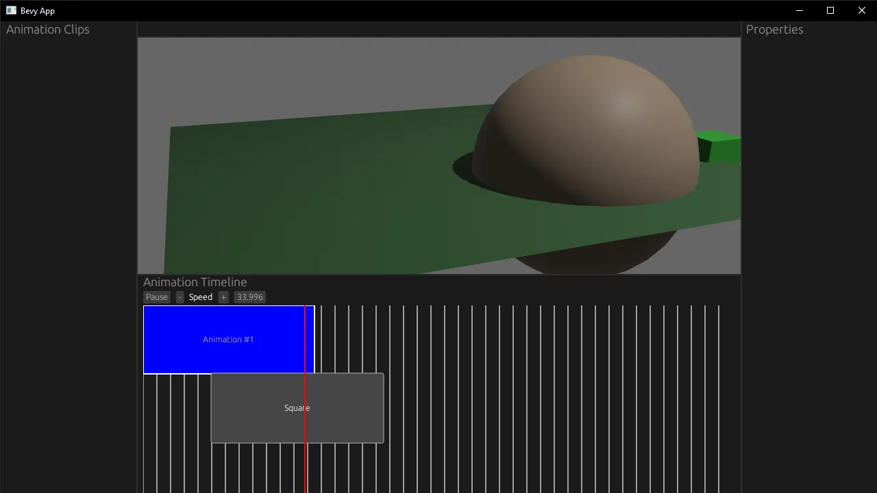
A button widget with the text Square is absolutely placed in a relative canvas container that contains a timeline graph drawing.
Advanced egui
Now that we have a grasp of the basics, let’s talk about more advanced use cases. What if we want to create a custom component? Or draw lines and shapes? I got you covered.
Custom Components
Creating a custom component usually involves composing various “primitives” like a container, text, or a button and creating a new component. This is similar to React where we create functional components that contain <div> and <button> nested inside.
The egui docs have an example of creating a custom counter component. You create a function to encapsulate your component and take the ui struct as a mutable reference so you can add your UI “primitives”. In this case, we create a horizontal flexbox that holds a label sandwich between two buttons.
fn ui_counter(ui: &mut egui::Ui, counter: &mut i32) {
    // Put the buttons and label on the same row:
    ui.horizontal(|ui| {
        if ui.button("-").clicked() {
            *counter -= 1;
        }
        ui.label(counter.to_string());
        if ui.button("+").clicked() {
            *counter += 1;
        }
    });
}
In our app we’d use this like this:
// Ideally this would be stored in an "app-level" state
// since UI runs in a game loop, this would get overriden.
let mut counter = 0;

// Render our counter component
ui_counter(&mut ui, &mut counter);
This works great when you need to take repetitive logic and modularize it.
Drawing shapes
What if we want to draw directly onto the screen? Kinda like a <canvas> in HTML, drawing shapes like lines, circles, or rectangles?
egui can do that too using it’s Painter struct. It works exactly like you’d think — it takes your “draw commands” (like a line or circle) and “paints” them onto the screen. It does this in layers to allow for stacking of drawings.
This process isn’t documented too well so I struggled to figure out the “right way” to use this API. But after digging into the Bezier Curve example I was able to figure out a proper methodology.
Basically the UI struct has a method called allocate_painter() that creates a new Painter struct in a space we designate (defined the width and height in a Vec2). Then we can use the painter to draw different Shapes — like a LineSegment, Rect, or Circle. Each shape has it’s own properties that define the drawing (like the circle radius, or a rectangle’s size).
Drawing a line
Here’s an example for drawing a line.
// Create a "canvas" for drawing on that's 100% x 300px
let (response, painter) = ui.allocate_painter(
    bevy_egui::egui::Vec2::new(ui.available_width(), 300.0),
    Sense::hover(),
);

// Get the relative position of our "canvas"
let to_screen = RectTransform::from_to(
    Rect::from_min_size(Pos2::ZERO, response.rect.size()),
    response.rect,
);

// The line we want to draw represented as 2 points
let first_point = Pos2 { x: 0.0, y: 0.0 };
let second_point = Pos2 { x: 300.0, y: 300.0 };
// Make the points relative to the "canvas"
let first_point_in_screen = to_screen.transform_pos(first_point);
let second_point_in_screen = to_screen.transform_pos(second_point);

// Paint the line!
painter.add(Shape::LineSegment {
    points: [first_point_in_screen, second_point_in_screen],
    stroke: Stroke {
        width: 10.0,
        color: Color32::BLUE,
    },
});
This creates a canvas that’s 100% the width of the container, and 300 (pixels?) tall. Then it draws a line inside, and we have to convert the position coordinates to be relative to the canvas (or it’d get clipped off depending on position of canvas).
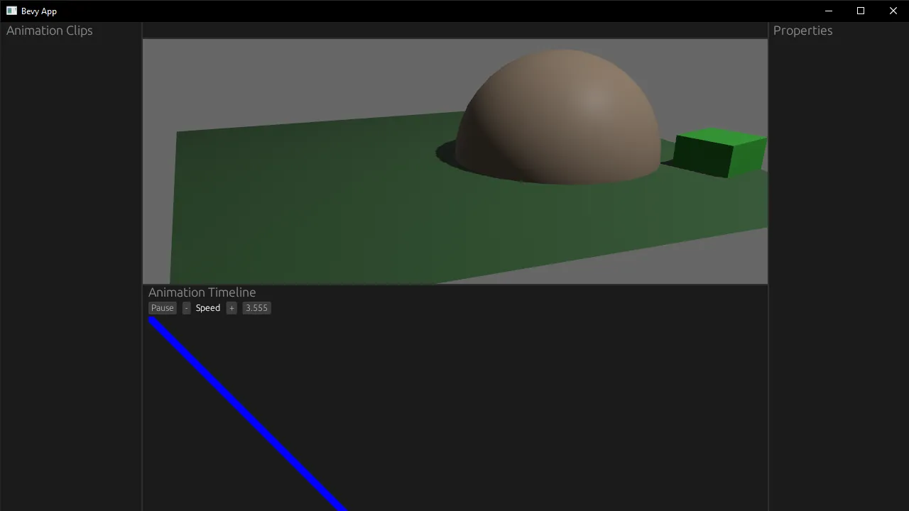
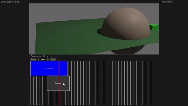
A blue diagonal line that’s 10 pixels thick is drawn inside the animation timeline panel starting from the top left corner of the canvas container going down to the right.
You can see this full example here on Github.
Drawing a rectangle
Now that we have access to a “canvas” using the Painter struct we created, we can use that to draw more Shapes — like our LineSegment, a Rect, or even Text.
We want to draw a square (or rectangle), so we use the Shape::Rect enum. It takes a RectShape struct inside that defines our rectangle, like the min/max or top left/bottom right corners - or the fill color.
// Draw squares representing animations
painter.add(Shape::Rect(egui::epaint::RectShape {
    rect: Rect {
        // The top left corner of rectangle
        // Still screen space positioning - so we convert using RectTransform
        min: to_screen.transform_pos(Pos2 { x: 0.0, y: 0.0 }),
        // The bottom right corner of rectangle
        max: to_screen.transform_pos(Pos2 { x: 250.0, y: 100.0 }),
    },
    rounding: Rounding {
        nw: 0.0,
        ne: 0.0,
        sw: 0.0,
        se: 0.0,
    },
    fill: Color32::BLUE,
    stroke: Stroke {
        width: 2.0,
        color: Color32::WHITE,
    },
}));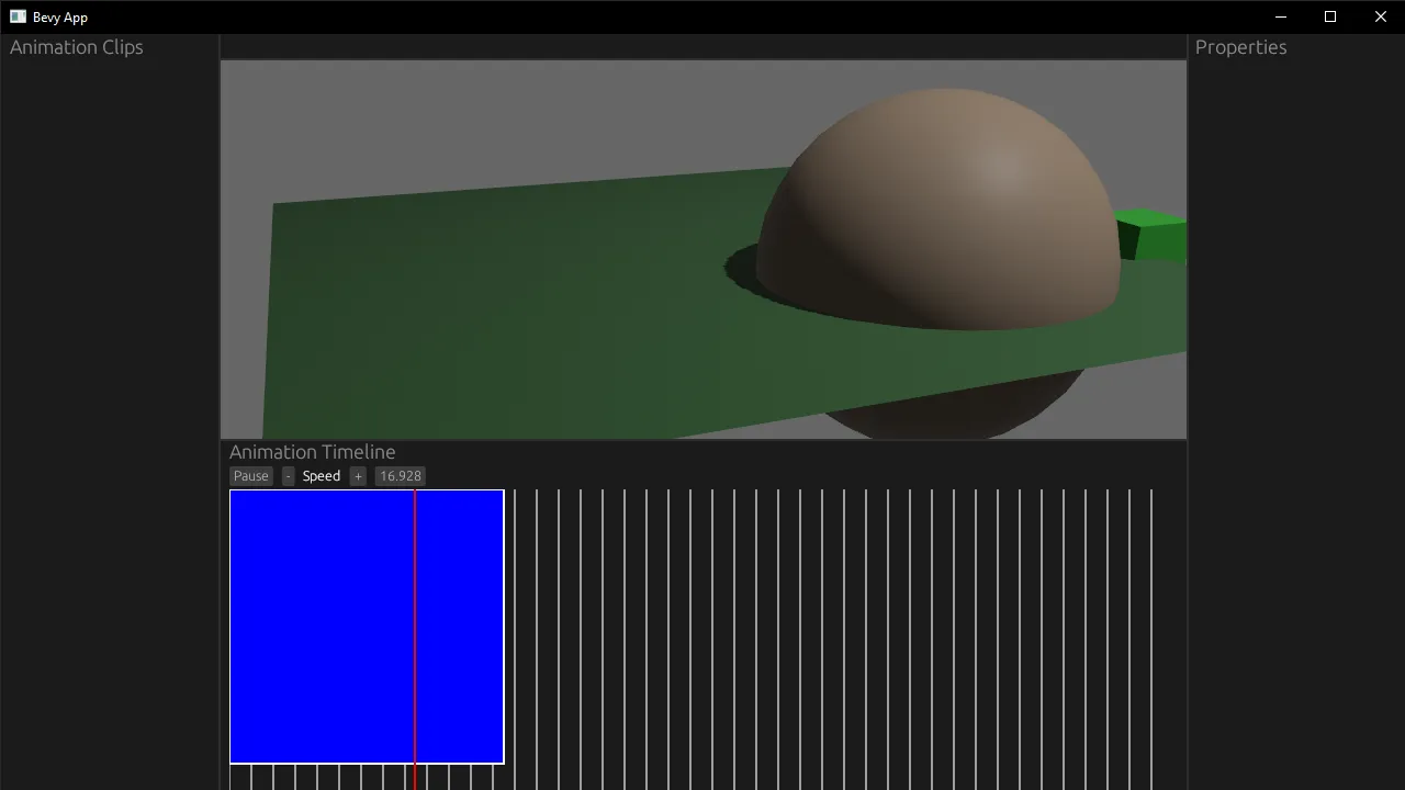
A blue square with a 2 pixel white stroke is now drawn on the animation timeline.
You can see this full example here on Github.
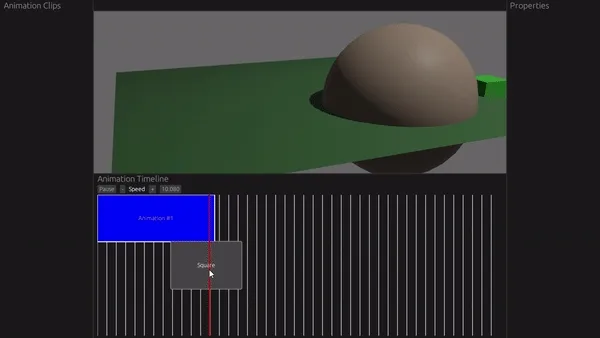
Drag and drop
You can use the drag_started() and drag_released() methods to check for dragging if you change the default “sense” of a Widget to Sense::drag().
let animation_clip_button = ui.put(
    Rect {
        min: to_screen.transform_pos(Pos2 { x: 100.0, y: 100.0 }),
        max: to_screen.transform_pos(Pos2 { x: 350.0, y: 200.0 }),
    },
    egui::Button::new("Square").sense(Sense::drag()),
);

if animation_clip_button.drag_started() {
    println!("Button dragging, track movement");
    dbg!(animation_clip_button.hover_pos());
    dbg!(animation_clip_button.drag_delta());
    dbg!(animation_clip_button.interact_pointer_pos());
}
if animation_clip_button.drag_released() {
    println!("Button done, let's move it");
    dbg!(animation_clip_button.hover_pos());
    dbg!(animation_clip_button.drag_delta());
    dbg!(animation_clip_button.interact_pointer_pos());
}
But how do we get the user’s mouse position while dragging?
If you use hover_pos() it only works “inside” the button (similar to the DragValue “slider”-style widget). If you drag outside the edges of the button, it returns a None for the drag value.
If you use drag_delta() you get a vector back that’s usually 0, 0 despite moving a lot. I’m guessing this is more of a directional vector or something, since I randomly got values when I randomly shook the mouse around.
Seems the best bet is interact_pointer_pos(). This gives you the screen space coordinates of the mouse at any point - meaning you can drag outside the bounds of the button and still detect the position.
Timeline State
Let’s create a Bevy resource to keep track of some state. We’ll need to store the position of our rectangle (so we can change it over time when it gets dragged). And we’ll need the position where the user started dragging. This gives lets us figure out how far they dragged, since when we finish dragging we get the final position — we’ll subtract that from the start and figure out how much it moved.
#[derive(Resource)]
struct TimelineState {
    // Where did user start dragging? Used for calculating difference.
    drag_start: Pos2,
    // Position of the clip. Ideally this would be a vec later for multiple clips.
    position: Pos2,
}
impl Default for TimelineState {
    fn default() -> Self {
        TimelineState {
            drag_start: Pos2 { x: 0.0, y: 0.0 },
            position: Pos2 { x: 100.0, y: 100.0 },
        }
    }
}
New drag system
Now we can access the TimelineState Resource and update it as we detect any start or end of dragging. When the user finishes dragging, we’ll calculate the difference between the end and the start drag positions (the latter being in our TimelineState). And then we’ll update our boxes position by mutating it’s position stored in the TimelineState.
📘 You’ll notice we only care about the X position, since we only want the user dragging along the same “animation track” for now. Later we can handle toggling between tracks.
fn ui_example_system(
    mut contexts: EguiContexts,
    mut occupied_screen_space: ResMut<OccupiedScreenSpace>,
    mut animation_state: ResMut<AnimationState>,
    mut timeline_state: ResMut<TimelineState>,
    animation_players: Query<&mut AnimationPlayer, With<Name>>,
) {
	// ...other code...

	// Check for dragging and store initial position
	if animation_clip_button.drag_started() {
	    println!("Button dragging, track movement");
	    dbg!(animation_clip_button.interact_pointer_pos());
	    if let Some(new_drag_start_position) =
	        animation_clip_button.interact_pointer_pos()
	    {
	        timeline_state.drag_start = new_drag_start_position;
	    }
	}
	// Check if dragging is done, calc difference, and update button position
	if animation_clip_button.drag_released() {
	    println!("Button done, let's move it");
	    dbg!(animation_clip_button.interact_pointer_pos());
	    if let Some(new_drag_end_position) =
	        animation_clip_button.interact_pointer_pos()
	    {
	        dbg!(new_drag_end_position.x - timeline_state.drag_start.x);
	        let drag_delta = new_drag_end_position.x - timeline_state.drag_start.x;
	        timeline_state.position.x = timeline_state.position.x + drag_delta;
	    }

	    // Reset the drag
	    timeline_state.drag_start = Pos2 { x: 0.0, y: 0.0 }
	}
}
This works to move the box around as we click and drag it.
Example of a simple drag and drop system. When the user stops dragging, the button “teleports” to the next position instantly.
You can see this full example here on Github.
Smoother dragging
Although it’s not exactly what happens in most apps. We usually can see the box dragging along with the user, allowing them to better visualize the final position.
To be able to achieve that, we need to know when our user is dragging. So let’s add that to our TimelineState Resource.
#[derive(Resource)]
struct TimelineState {
    // Is user dragging any timeline clips?
    dragging: bool,
    // Where did user start dragging? Used for calculating difference.
    drag_start: Pos2,
    // Position of the clip. Ideally this would be a vec later for multiple clips.
    position: Pos2,
}
impl Default for TimelineState {
    fn default() -> Self {
        TimelineState {
            dragging: false,
            drag_start: Pos2 { x: 0.0, y: 0.0 },
            position: Pos2 { x: 100.0, y: 100.0 },
        }
    }
}
We can just toggle the boolean to true when we detect dragging, and false when it’s ended. Then we can use that boolean in a conditional block to check to update our clip’s position (instead of at the end of the dragging).
// Check for dragging and store initial position
if animation_clip_button.drag_started() {
    println!("Button dragging, track movement");
    dbg!(animation_clip_button.interact_pointer_pos());
    if let Some(new_drag_start_position) =
        animation_clip_button.interact_pointer_pos()
    {
        timeline_state.drag_start = new_drag_start_position;
        timeline_state.dragging = true;
    }
}
// Is user dragging? Calc difference, and update button position
if timeline_state.dragging {
    if let Some(new_drag_end_position) =
        animation_clip_button.interact_pointer_pos()
    {
        // Calculate the difference from the last stored position
        let drag_delta = new_drag_end_position.x - timeline_state.drag_start.x;
        // Update the clip position in state
        timeline_state.position.x = timeline_state.position.x + drag_delta;
        // Update the last stored position to the mouse's current position
        // Since we're updating each "tick", this makes it dragging seamless
        timeline_state.drag_start.x = new_drag_end_position.x;
    }
}
// Check if dragging is done
if animation_clip_button.drag_released() {
    println!("Button done moving");
    // Reset the drag
    timeline_state.drag_start = Pos2 { x: 0.0, y: 0.0 };
    timeline_state.dragging = false;
}
Instantaneous drag and drop example
Now dragging feels a bit more natural and controlled, instead of teleporting into place. Although there is a little noticeable lag when you move it quickly, so there’s definitely room for improvement.
You can see this full example here on Github. I also found an example of a “kanban” style drag and drop.
📘 In this example we’d be able to drag the box outside the bounds of our “canvas”. So make sure to “clamp” the position of the box to the bounds of the “canvas” container. For example, the X position should never go lower than the X position of the “canvas” (
if timeline_state.position.x > 100.0 { update_position(); }).
Styling / Theming
Here’s a good example of handling theming. You use the egui context struct to get access to the default styles and “visuals” property. Then we use the set_visuals() method to change egui’s styling - and use the old theme to fill in any gaps we don’t customize.
use egui::{epaint, style, Color32};

/// Apply the given theme to a [`Context`](egui::Context).
pub fn set_theme(ctx: &egui::Context, theme: Theme) {
    let old = ctx.style().visuals.clone();
    ctx.set_visuals(egui::Visuals {
        override_text_color: Some(theme.text),
        hyperlink_color: theme.rosewater,
        faint_bg_color: theme.surface0,
        extreme_bg_color: theme.crust,
        code_bg_color: theme.mantle,
        warn_fg_color: theme.peach,
        error_fg_color: theme.maroon,
        window_fill: theme.base,
        panel_fill: theme.base,
        window_stroke: egui::Stroke {
            color: theme.overlay1,
            ..old.window_stroke
        },
        widgets: style::Widgets {
            noninteractive: make_widget_visual(old.widgets.noninteractive, &theme, theme.base),
            inactive: make_widget_visual(old.widgets.inactive, &theme, theme.surface0),
            hovered: make_widget_visual(old.widgets.hovered, &theme, theme.surface2),
            active: make_widget_visual(old.widgets.active, &theme, theme.surface1),
            open: make_widget_visual(old.widgets.open, &theme, theme.surface0),
        },
        selection: style::Selection {
            bg_fill: theme
                .blue
                .linear_multiply(if theme == LATTE { 0.4 } else { 0.2 }),
            stroke: egui::Stroke {
                color: theme.overlay1,
                ..old.selection.stroke
            },
        },
        window_shadow: epaint::Shadow {
            color: theme.base,
            ..old.window_shadow
        },
        popup_shadow: epaint::Shadow {
            color: theme.base,
            ..old.popup_shadow
        },
        ..old
    });
}

fn make_widget_visual(
    old: style::WidgetVisuals,
    theme: &Theme,
    bg_fill: egui::Color32,
) -> style::WidgetVisuals {
    style::WidgetVisuals {
        bg_fill,
        weak_bg_fill: bg_fill,
        bg_stroke: egui::Stroke {
            color: theme.overlay1,
            ..old.bg_stroke
        },
        fg_stroke: egui::Stroke {
            color: theme.text,
            ..old.fg_stroke
        },
        ..old
    }
}
The theme could be any shape really, but here’s what the pastel themes look like from catppuccin:
#[derive(Debug, Clone, Hash, PartialEq, Eq)]
pub struct Theme {
    pub rosewater: Color32,
    pub flamingo: Color32,
    pub pink: Color32,
    pub mauve: Color32,
    pub red: Color32,
    pub maroon: Color32,
    pub peach: Color32,
    pub yellow: Color32,
    pub green: Color32,
    pub teal: Color32,
    pub sky: Color32,
    pub sapphire: Color32,
    pub blue: Color32,
    pub lavender: Color32,
    pub text: Color32,
    pub subtext1: Color32,
    pub subtext0: Color32,
    pub overlay2: Color32,
    pub overlay1: Color32,
    pub overlay0: Color32,
    pub surface2: Color32,
    pub surface1: Color32,
    pub surface0: Color32,
    pub base: Color32,
    pub mantle: Color32,
    pub crust: Color32,
}

pub const LATTE: Theme = Theme {
    rosewater: Color32::from_rgb(220, 138, 120),
    flamingo: Color32::from_rgb(221, 120, 120),
    pink: Color32::from_rgb(234, 118, 203),
    mauve: Color32::from_rgb(136, 57, 239),
    red: Color32::from_rgb(210, 15, 57),
    maroon: Color32::from_rgb(230, 69, 83),
    peach: Color32::from_rgb(254, 100, 11),
    yellow: Color32::from_rgb(223, 142, 29),
    green: Color32::from_rgb(64, 160, 43),
    teal: Color32::from_rgb(23, 146, 153),
    sky: Color32::from_rgb(4, 165, 229),
    sapphire: Color32::from_rgb(32, 159, 181),
    blue: Color32::from_rgb(30, 102, 245),
    lavender: Color32::from_rgb(114, 135, 253),
    text: Color32::from_rgb(76, 79, 105),
    subtext1: Color32::from_rgb(92, 95, 119),
    subtext0: Color32::from_rgb(108, 111, 133),
    overlay2: Color32::from_rgb(124, 127, 147),
    overlay1: Color32::from_rgb(140, 143, 161),
    overlay0: Color32::from_rgb(156, 160, 176),
    surface2: Color32::from_rgb(172, 176, 190),
    surface1: Color32::from_rgb(188, 192, 204),
    surface0: Color32::from_rgb(204, 208, 218),
    base: Color32::from_rgb(239, 241, 245),
    mantle: Color32::from_rgb(230, 233, 239),
    crust: Color32::from_rgb(220, 224, 232),
};
egui resources
One of the things that helped me learn more about the egui API and how to properly use it was observing other people’s code. Here’s a few egui libraries, tools, and apps I was able to find that might solve a problem you have. And some videos that go over egui if you’re more of a visual learner.
If you’re looking for a community to share your work or ask questions I’d recommend **the egui Discord.**
Examples
UI Widgets
- egui_node_graph - Node graph system (like Unreal Blueprints)
- egui-gizmo - 3D transformation “gizmo” widget
- egui-notify - Notification widgets with animated progress bar
- egui-toast - Notification widgets
- egui-datepicker - Date picker widget (month-style view)
- egui_file - File dialog widget to browse folders and display lists of files
- egui-dropdown - Combobox widget (like a Dropdown you can search)
Tools / Utilities
- egui_inspect - Make egui debug panels powered by structs
- egui_hotkey - Keyboard hotkey library
- catppuccin_egui - Pastel color themes for egui
Apps
- blackjack - 3D procedural modeling tool (like Blender Geometry Nodes)
Videos
- Chris Biscardi does an overview of egui
- creativcoder has a series called Getting Started with Rust featuring egui
- Andrei Litvin builds an app to plot a sensor value in real time
- Jacob Bolda has a livestream exploring Tauri’s egui integration
Do what’s GUI for you
I hope this served as a solid introduction into egui and it’s core functionality. The documentation and examples are great, but I think there’s definitely room for dedicated docs that overview common processes and techniques. I had to spend some time experimenting with APIs and digging through the inline generated docs to figure out how to use them properly — and even then, I’m sure some stuff is wrong. Any docs that can eliminate this kind of friction would be fantastic.
But yeah, I hope this helped get you started faster and prototyping cool stuff sooner. As always, feel free to share your results or questions with me on Mastodon or Twitter.