Posted on
March 22, 2024
This has been a long time coming (the redesign and this blog). Like any designer, I can’t keep the same personal site design for more than 1 year or so without getting the itch to redesign it. Whether it be from a whim of inspiration or the urge to share new experiences — it’s a call that’s impossible to deny.
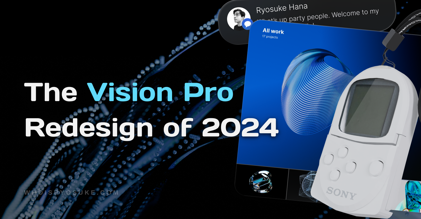
After seeing the reveal of Apple’s Vision Pro headset, and the new design system and UI, I was pretty pumped. For years already I’d been tinkering on and exploring 3D UI solutions personally and professionally, so it was pretty cool to see a company as big as Apple approach the problem.
It reinvigorated my ambition to create a 3D UI on the web, and I wanted to explore it from the perspective of Apple’s decisions. How much could I learn and takeaway? And what could practically be applied in a web context — vs the luxury of their native AR/VR experience?
This site is my exploration into that, as well a place for me to experiment with other concepts I’ve been absorbed into. From gamification to gamepad-based focus navigation — I had some big plans for this place.
This article will be less of a “tutorial” and more of a case study; a documentation of my process, results, and findings.
The Vision
These were the core “features” I setup for myself initially:
- 3D UI inspired by Vision Pro
- 3D PocketStation as a focal piece. Ideally playable, but I’d settle for animated
- Gamification with achievements and gamepad input
- Customization of the theme.
- Portfolio with video support for my new 3D work
I also did a bit of planning around each of these topics, thinking about the architecture, execution, and integration of all these features. Then I moved on to the inevitable design phase.
Design Decisions
Initial Research
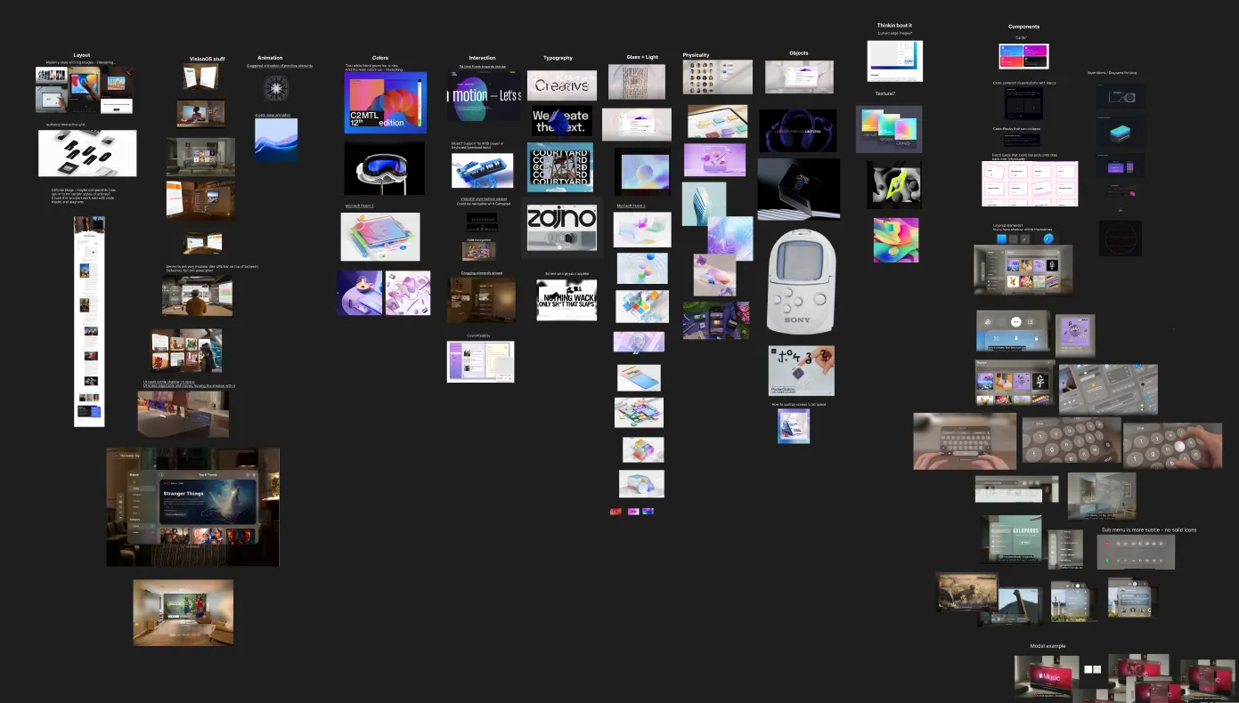
As always, I started with a mood board to establish a direction for the design, as well as seek out features and elements I’d like to incorporate.
I knew from the start I wanted it to be a VisionOS inspired interface. Something “3D” feeling - in a space.
I broke things down into categories as I searched. For example, the right side were specific components I found interesting, like Apple’s spatial keyboard.
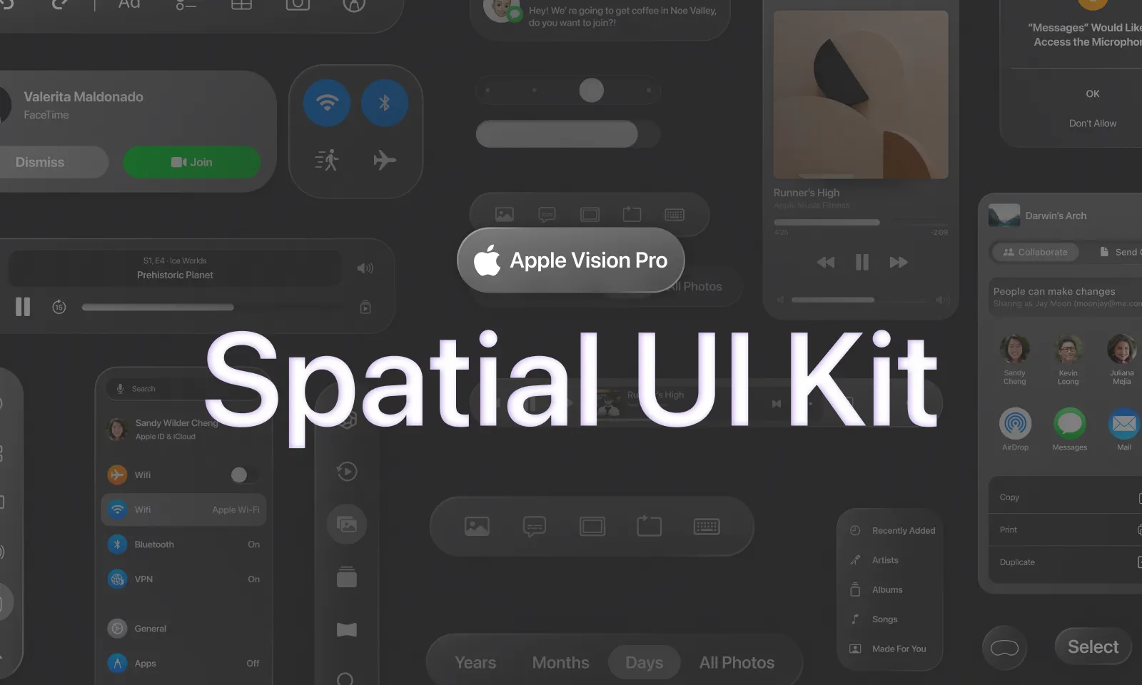
I also found a Figma library with a lot of pre built components that I referenced as well (since it was easier than scrobbling through Apple videos). I didn’t actually use any of the components or styling though beyond some mockups, I didn’t think it matched the aesthetic I was going for completely.
Initial Explorations
Once I had the design direction established, I started prototyping to determine the technical feasibility of 3D features on the web. How would the glass look? How do the “app” windows live in the space and transition to different pages?
I spun up a NextJS site as a sandbox as started iterating on these concepts.
Glass Effect
This is ground I know the web has tread plenty, so much so that in CSS 3.0 we have a filter property to blur elements to create a glass-like effect. But how do we replicate Apple’s glass specifically?
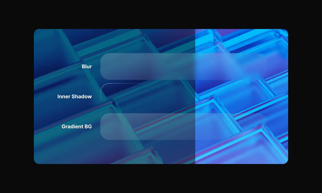
I started in Figma, since I’d be using CSS anyway, and created a few quick glass samples to get a feel for things. I played with the background color and background blur to try and match Apple’s glass transparency. And I used the inner and outer shadows to “pop” the button out in 3D a bit and simulate fake lighting (with highlights on top, and shadows behind it).
This led me to a more refined version, and helped me think about things like legibility with the glass on different backgrounds (as you can see in the top shot, some glass is much easier to read on than others).
Moving on to code, I was able to just copy a lot of the CSS directly from Figma (like gradients and shadows). I had to convert a gradient stroke to an inner shadow since CSS doesn’t support gradient strokes. What structurally made it interesting was accommodating for the blur.
When you blur an element in CSS, you also blur all the content in the element. So the text inside, any images, etc — all get blurred along with the background. So how do we get a blurred background without blurring the content? We take advantage of CSS’ :before and :after pseudo selectors. They allow us to render another element alongside our current element.
This is what the <Glass /> component looks like in practice - you can see most of the styling happens in the :before:
type GlassProps = BoxProps & {
  transparent?: boolean;
  blur?: keyof Theme["blur"]["radius"];
  borderRadius?: keyof Theme["radius"];
  modal?: boolean;
};

const Glass = styled(Box)<GlassProps>`
  position: relative;
  border-radius: ${({ theme, borderRadius }) =>
    borderRadius in theme.radius && theme.radius[borderRadius]};

  /* Animation */
  @media (prefers-reduced-motion: no-preference) {
    transition-property: transform;
    transition-duration: 710ms;
  }

  /* Border gradient - also an inset for extra "gloss effect" */
  &:before {
    content: "";
    position: absolute;
    top: 0;
    right: 0;
    bottom: 0;
    left: 0;
    z-index: -2;
    background: ${({ theme, transparent, modal }) => {
      let bgColor = !transparent && theme.colors.glass;
      if (theme.modal && !modal) bgColor = theme.colors.glassOverlay;
      return bgColor;
    }};
    backdrop-filter: blur(
      ${({ theme, blur }) =>
        theme.modal ? theme.blur.radius[4] : theme.blur.radius[blur]}
    );
    border-radius: inherit;
    border: 0.0625em solid rgba(255, 255, 255, 0.1);

    box-shadow: 0 2px 16px 0 rgba(10, 10, 14, 0.1);

    -webkit-mask-image: ${({ theme, blur, modal }) => `linear-gradient(
      270deg,
      rgba(0, 0, 0, 1),
      rgba(0, 0, 0, ${
        theme.modal && !modal ? theme.blur.mask[2] : theme.blur.mask[blur]
      }) 100%
    )`};

    /* Animation */
    @media (prefers-reduced-motion: no-preference) {
      transition-property: background;
      transition-duration: 710ms;
    }
  }
`;
Along with all the effects in Figma, I also added a mask to ease the blur effect. The -webkit-mask-image property is essentially a black to transparent black gradient from one side to the other (at a bit of an angle). This hides the blur and background in the bottom right corner to give it a more “clear” appearance, and break up how “flat” the blur effect looked uniformly across the surface.
You can also see I do use a few props to control some aspects of the glass. There’s a blur prop you can provide to change the intensity of the blur on the glass. I have all the values preset in the theme and the props are just the keys that map to this:
export const BLUR_PROPERTIES = {
  radius: {
    0: "0px",
    1: "4px",
    2: "12px",
    3: "36px",
    4: "48px",
    5: "64px",
    6: "128px",
  },
  mask: {
    0: "0.1",
    1: "0.25",
    2: "0.5",
    3: "0.9",
  },
};
I also have a few glass “colors” that I swap between. They’re all just darker shades of the main glass gradient.
{
  glass: "rgba(40, 40, 40, 0.65)",
  glassBorder: "rgba(40, 40, 40, 0.75)",
  glassSidebar: "rgba(40, 40, 40,0.2)",
  glassOverlay: "rgba(40, 40, 40,0.05)",
  glassContrast: "rgba(40,40,40,0.75)",
  darkGlass: {
    panel: "rgba(31,31,31,0.6)",
    input: "rgba(0,0,0,0.25)",
    focused: "rgba(200,196,193,0.8)",
  },
}
In order to share some styling logic between components, I also created some presets for certain effects, like the “border shine”:
import { css } from "styled-components";

export const borderShineEffect = () => css`
  content: "";
  position: absolute;
  top: 0;
  right: 0;
  bottom: 0;
  left: 0;
  z-index: -1;
  margin: -1px -1px 0 -1px;
  border-radius: inherit;
  background: ${({ theme }) => theme.colors.glass};
  box-shadow: inset 1px 1px 1px rgba(255, 255, 255, 0.2);
  pointer-events: none;
`;
No Dark / Light mode
This was a big one to wrap my head around. Apple doesn’t use light or dark modes in Vision Pro. The UI is so “adaptive” that it doesn’t need it.
Is this possible? Maybe, if we change the way we think of light and dark modes. Instead of focusing on the UI completely, we can also adapt the user’s environment (since we’re in control of it on the web). We can darken the space or use a different HDRI skybox to convey a different scene and color story for the UI to play off of.
In the end though I did end up having a separate light and dark theme, just to provide a different option for users.
Modal vs In-Space Windows
The beauty of Vision Pro is that it’s in 3D space. It’s cool to see a window tilted off to the side in perspective. But is this possible on the web? And how “immersive” is it when we consider the true medium — a monitor or phone and not an AR/VR device.

I created a few prototypes testing out different window configurations, like a main window and side windows on each side.
It worked, but didn’t make much sense. The problem was clear: Web users aren’t in a 3D Space. It’s flat. Hard truth. You can replicate the “look” of the 3D in a browser, but the content shrinks too small.
Apple resolves this in VR by allowing the user to either move closer to UI, or drag it. I could let the user control a master “UI depth”, but then things scale weird? Fonts in particular get blurry.
Also experimented with using a 3D HDRI BG using ThreeJS and turning camera as windows moved to emphasize the user in space. Also worked, but felt a little cheesy? Needed a few more levels of refinement to polish.
Overlays
For modals, you tend to do a black overlay over the whole page to create greater depth and contrast between the content and the modal.
For Vision Pro, they don’t do this, because a black overlay would be a “curtain” over the entire user’s space, which would probably be disorientating or even dangerous in some cases. Not as much an issue on web, but since we’re replicating the style and “vision” if you will, we’ll adhere to this rule.

Glass instead gets darker when it’s behind a modal. It’s almost like a black overlay was applied to everything and the containers act as a clipping mask. This is powered by the Styled Components theme, where we keep a modal property that lets the UI know if it’s in a modal or not. Then for the modal itself, we have a special modal prop on the <Glass /> component that overrides this behavior — so everything except the modal becomes darker.
background: ${({ theme, transparent, modal }) => {
  let bgColor = !transparent && theme.colors.glass;
  // We check here if theme is set to modal mode,
  // and if this component isn't inside modal
  if (theme.modal && !modal) bgColor = theme.colors.glassOverlay;
  return bgColor;
}};
The modal also animates in using the z-index (coming from camera/users view toward content), and sits in front of the content a bit (emphasizing the use of depth in 3D space).
Technically Apple allows for multiple modals, and if you look closely at their spec, each subsequent modal applies a darker color on each layer below. To allow for this, you’d just swap the boolean I use for a number, and track what “level” of modal you’re on.
Modals also have a much more intense blur than other glass containers it seems - so I made sure to apply this based on the modal prop. And finally, I made the text also fade a bit using the modal token in the theme.
The modal animation was fairly simple thanks to CSS 3D transforms. But again — since the web is so inherently “flat”, and the content sits so close already, I pushed the content back further when the modal is open.
Using the same modal token in the theme, if the modal is open containers will transition further back into space. This helps emphasize the depth occurring between modal and content.
/* Modal support - pushes content "back"  */
transform: ${({ theme, modal }) =>
  theme.modal && !modal ? MODAL_OPEN_TRANSFORM : MODAL_CLOSED_TRANSFORM};
UI Components
To replicate the Vision Pro styling, I had to create a lot of custom components to mimic their aesthetic. From the <Glass /> containers that hold most content, to the <Button /> components (and icon variants), as well all the inputs like a <Slider />.
For the components I followed a lot of the patterns I’ve used for previous design systems. I used Styled Components to style, created a theme to manage design tokens, and I added Styled System to enable utility style props. I created a few primitive components that formed the basis for the rest of the components, like a <Box /> that acted as a flexible container, or the <Text /> component that provided consistent text rendering across the app.
I created all of these components from scratch and tried my best to follow WCAG a11y guidelines. But honestly, I’d just go with react-aria next time or a similar library if I was building another project. This was a nice refresh on all the best practices, but damned if this step was a huge time sink “recreating the wheel” (and ultimately missing some WCAG requirements due to time constraints).
PocketStation
With how much of the site was inspired by Apple and basically a copy of a lot of their design system — I needed a piece of hero content for the homepage that would speak to me and my brand. I knew early on I wanted the PocketStation from the PlayStation 1 to be the centerpiece.
Modeling
This one took some time since I used it as an opportunity to practice different modeling techniques in Blender.
I started by laying down all the reference images and then tackling each piece one by one, starting with the back - since it was the simplest face on the object.


Cutting holes in 3D
The biggest takeaway with this project was how to cut nice holes out of a mesh. You could obviously use the boolean tool for the quickest effects, but they’re also the cheapest, producing a low quality mesh.
💡 You can also use the LoopTools plugin that comes built-in with Blender to cut shapes out of surfaces. This produces better results, but can be tricky to use.
I watched a lot of videos and had to compile various techniques to get the best (and easiest) result, producing the best topology. I settled on this technique that works really well:
- Basically make a square (or rectangle) with 4 vertices. This is the key part. Make a flat little part on your mesh for the hold to fit into. then you can adjust it later to fit more seamlessly.
- Cut the square in half horizontally, then half vertically (so it becomes a 4x4 grid).
- Select the center vertex and use the bevel tool. In the settings, change the Affect to Vertices. And make sure to turn down the shape slider to achieve the circle you want. Then you can increase the number of segments to make the circle more subdivided or low poly.

- You’ve got a circle! Now you can take the outside square shape and conform it more to your object.
- Protip: When choosing the number of circle subdivisions, consider the number of vertices your mesh currently has. The closer your match, the easier it is to line up the holes seamlessly.
Depending on what you need, you could just create a circle mesh and add it to your object. This technique is more for punching holes out of existing meshes.
Importing to the web
This process was pretty simple. I kept all the pieces separate, but had them parented to a single “Empty” object. I exported the model as a GLTF file. Then I used gltf2jsx to create a React Three Fiber compatible component. This generated a <group> from my “empty” with all the separate pieces as nested <mesh>.
The big part was the setup of the model in Blender. I needed to separate all the parts that I needed to animate separately, like the lid to rotate open. Or separating the screen to make texturing easier. And making sure to name all these layers in Blender helped identify them after export, since the name carries over as a <mesh> prop.
Animating the model
I wanted the model to transition in, then sit and infinitely rotate around. And I also wanted the lid to open and close occasionally.
I set this up using react-spring. They have direct support for React Three Fiber components. I used their useSpring() hook, along with the <animated.mesh> component. The <AnimatedMesh> component is just a wrapper around that providing some defaults shared across all meshes.
const { rotation } = useSpring({
  config: { duration: 4200, easing: easings.easeInOutQuad },
  delay: 4200,
  loop: false,
  from: {
    rotation: [0, 0, 0],
  },
  to: [
    {
      rotation: [-1, 0, 0],
    },
    {
      rotation: [0, 0, 0],
    },
  ],
});

<AnimatedMesh
  castShadow
  receiveShadow
  //@ts-ignore
  geometry={nodes.BodyFrontButtonsConfirm.geometry}
  material={materials["Material.030"]}
  rotation={customizations.animation.active ? rotation : [0, 0, 0]}
  position={confirmY}
/>;
Animating the buttons
This was fairly simple to setup with the input system I had in place. I grab the input (aka controls) from a Zustand store, pass it to the <PocketStation /> component, and then a useSpring() reacts based on the controls.
export default function PocketStation({ controls, ...props }: Props) {
  const { upY, downY, leftY, rightY, confirmY } = useSpring({
    upY: controls.up ? BUTTON_PRESSED_DEPTH : BUTTON_DEFAULT_DEPTH,
    downY: controls.down ? BUTTON_PRESSED_DEPTH : BUTTON_DEFAULT_DEPTH,
    leftY: controls.left ? BUTTON_PRESSED_DEPTH : BUTTON_DEFAULT_DEPTH,
    rightY: controls.right ? BUTTON_PRESSED_DEPTH : BUTTON_DEFAULT_DEPTH,
    confirmY: controls.confirm ? BUTTON_PRESSED_DEPTH : BUTTON_DEFAULT_DEPTH,
  });

  return (
    <animated.group {...props} dispose={null}>
      <AnimatedMesh
        castShadow
        receiveShadow
        //@ts-ignore
        geometry={nodes.BodyFrontButtonsLeft.geometry}
        material={materials["Material.030"]}
        rotation={customizations.animation.active ? rotation : [0, 0, 0]}
        position={leftY}
      />
      <AnimatedMesh
        castShadow
        receiveShadow
        //@ts-ignore
        geometry={nodes.BodyFrontButtonsUp.geometry}
        material={materials["Material.030"]}
        rotation={customizations.animation.active ? rotation : [0, 0, 0]}
        position={upY}
      />
    </animated.group>
  );
}
Screen Animation

First attempt:
My initial goal was to have the PocketStation fully playable. So I needed a setup where I could update the screen with dynamic information. You can see my branch full of attempts here.
The first setup was to use an offscreen canvas to load and animate screen images inside. Each image would represent a screen - or parts of the screen that needed to animate separately. Then that canvas would be sent over to the PocketStation screen’s material shader as an image, where it’d get rendered onto the actual screen.
Here I created a component to contain all the offscreen drawing, and then separated each screen into it’s own component. It uses an <img> component with the screen. Then we draw that image to a canvas. When we draw it to the canvas, we have complete control over what’s being displayed, so we can do things like “animate” it by altering the X and Y coordinates of the image on the canvas.
import { useAppStore } from "@store/app";
import React, { useEffect, useRef } from "react";
import { easings, useSpring } from "react-spring";
import PSIntroScreen from "./screens/PSIntroScreen";

type Props = {};

const PocketStationScreenCanvas = (props: Props) => {
  const { pocketStationAnimation, setPSAnimation } = useAppStore();
  const canvasRef = useRef<HTMLCanvasElement>(null);
  const imageRef = useRef<HTMLImageElement>(null);

  // Grabs the canvas and fills with base UV texture, then returns context for use
  const getContextAndDrawBase = () => {
    const ctx = canvasRef.current.getContext("2d");
    // clear canvas
    ctx.clearRect(0, 0, ctx.canvas.width, ctx.canvas.height);
    // context.fillStyle = "#FFFFFF";
    // context.fillRect(0, 0, context.canvas.width, context.canvas.height);
    ctx.filter = "saturate(150%)";
    ctx.drawImage(imageRef.current, 0, 0);
    ctx.save();

    return ctx;
  };

  useEffect(() => {
    if (canvasRef.current) {
      const context = getContextAndDrawBase();

      // Draw screens
      // context.drawImage(screenIntroHelloRef.current, 460, 350);

      // Draw random stuff!
      //   context.fillStyle = "#000000";
      //   context.fillRect(560, 300, 20, 20);
    }
  }, []);

  return (
    <>
      <canvas
        ref={canvasRef}
        id="pocketstation-screen"
        width={1024}
        height={1024}
        style={{ position: "absolute", top: "-9999em", left: "-9999em" }}
        // style={{ position: "absolute", top: 0, left: 0, zIndex: 999 }}
      />
      <img
        ref={imageRef}
        src="/images/Body.Front.Screen.Rotated-textured1.png"
        style={{ position: "absolute", top: "-9999em", left: "-9999em" }}
      />

      <PSIntroScreen getContextAndDrawBase={getContextAndDrawBase} />
    </>
  );
};

export default PocketStationScreenCanvas;
And here’s what the screen’s look like:
import React, { useRef } from "react";
import { easings, useSpring } from "react-spring";
import { createScreenClipMask } from "../animation";
import { useAppStore } from "@store/app";

type Props = {
  getContextAndDrawBase: () => CanvasRenderingContext2D;
};

const PSIntroScreen = ({ getContextAndDrawBase }: Props) => {
  const screenIntroHelloRef = useRef<HTMLImageElement>(null);
  const {
    pocketStationAnimation,
    pocketStationAnimating,
    setPocketStationAnimating,
  } = useAppStore();

  useSpring({
    config: { duration: 4200, easing: easings.easeInOutQuad },
    delay: 4200,
    loop: false,
    from: {
      x: 0,
      y: 0,
    },
    to: [
      {
        x: 350,
        y: 460,
      },
    ],
    onStart(result, ctrl, item) {
      // console.log("screen animation started");
      setPocketStationAnimating(true);
    },
    onChange(result, ctrl, item) {
      if (result.value) {
        drawIntro(350, result.value.y);
      }
    },
    onRest(result, ctrl, item) {
      // if (pocketStationAnimating) setPocketStationAnimating(false);
    },
  });

  const drawIntro = (x: number, y: number) => {
    // console.log("drawing intro", x, y);
    const ctx = getContextAndDrawBase();

    createScreenClipMask(ctx);

    // Draw screens
    ctx.drawImage(screenIntroHelloRef.current, x, y);
  };

  return (
    <img
      ref={screenIntroHelloRef}
      src="/images/ps-screens/intro-hello-rotated.png"
      style={{ position: "absolute", top: "-9999em", left: "-9999em" }}
    />
  );
};

export default PSIntroScreen;
This worked, but crashed over time because ThreeJS or WebGL didn’t like having the material updating constantly. I had the material updating in a requestAnimationFrame which updated 60fps or so, which was too much. Then I used React Spring’s onChange callback to replicate the RAF callback - and leverage their animation utilities. I think I tried optimizing it a bit, but it didn’t seem like a stable approach.
Second attempt:
This one I scaled down my ambition a bit and only wanted an animated intro sequence. When the PocketStation boots up, it plays a small intro message then boots into a home screen. I wanted to pay homage to that and include the “Hello” message, as well as Toro Inoue, one of PlayStations early mascots.

I first setup the screens in Figma. I replicated the pixel style by creating vector rectangles for each pixel.


📁 Once I tested things in the shader, it seems like inverting things would make it easier to display, that’s why everything is mirrored and flipped. I think my UVs might have been flipped.
To accomplish this practically, it was very similar to the previous method, but all done inside a fragment shader.
uniform sampler2D baseTexture;
uniform sampler2D introTexture;
uniform sampler2D uiTexture;
uniform sampler2D welcomeToroTexture;
uniform sampler2D welcomeTextTexture;
uniform sampler2D heartTexture;
uniform int screenIndex;
uniform float time;
uniform float offset;
uniform vec3 color;
varying vec2 vUv;
uniform float stop;

void main() {
  float brightness = 0.1;
  float intensity = 0.1;

  vec4 baseImage = texture2D(baseTexture, vUv);

  vec4 currentScreen = vec4(0);
  vec4 currentScreenAnimated = vec4(0);
  float duration = 0.0;

  // Render the welcome screen
  if(time < 8.0) {
    duration = 3.0;
    float yAnimation = mix(0.5, 0.0, sin(time / duration));
    vec2 animation = vec2(0, yAnimation);
    currentScreen = texture2D(introTexture, vUv - animation);
    currentScreenAnimated = vec4(currentScreen.rgb, sin(time / duration));
    // vec4 combinedColor = adjustedColor * welcomeImage;
  }
  if(time > 8.0) {
    // We want time to start from 0 for animation,
    // so we offset by prev duration * 2 (since it loops)
    float animationTime = time - 8.0;
    duration = 3.0;
    vec4 toro = texture2D(welcomeToroTexture, vUv);
    if(animationTime > duration) {
      toro = texture2D(welcomeTextTexture, vUv);
    }
    currentScreen = toro;
    currentScreenAnimated = vec4(currentScreen.rgb, min(animationTime, duration) / duration);
    // vec4 combinedColor = adjustedColor * welcomeImage;
  }

  // Combine all the screens
  // We `pow()` the alpha to help white aliasing on some screens
  vec4 adjustedColor = vec4(baseImage.rgb + brightness + intensity, baseImage.a);
  vec4 combinedColor = mix(adjustedColor, currentScreenAnimated, pow(currentScreen.a, 1.4));
  gl_FragColor.rgba = combinedColor;
  // gl_FragColor.rgba = vec4(0.0, 0.0, 1.0, 1.0);
  // gl_FragColor.rgba = vec4(vec3(0.), 1.);
}
I have multiple images loaded into the shader, and using a few shader uniforms I control the state of the animation. There’s a uniform that controls the current screen, and another one for for animation time.
<mesh
  ref={frontPanelRef}
  castShadow
  receiveShadow
  //@ts-ignore
  geometry={nodes.BodyFrontScreen.geometry}
  material={materials.PS_FrontScreen}
>
  {/* @ts-ignore */}
  <screenShaderMaterial
    time={0}
    baseTexture={new TextureLoader().load(
      "./images/Body.Front.Screen.Rotated-textured1.png"
    )}
    introTexture={new TextureLoader().load(
      "./images/ps-screens/screen-intro.png"
    )}
    welcomeToroTexture={new TextureLoader().load(
      "./images/ps-screens/screen-welcome-toro.png"
    )}
    welcomeTextTexture={new TextureLoader().load(
      "./images/ps-screens/screen-welcome.png"
    )}
    heartTexture={new TextureLoader().load(
      "./images/ps-screens/screen-heart.png"
    )}
  />
</mesh>
And as you can see on the frontpage now, it works pretty well.
Features
Once I had the initial exploration period finished, I moved on to implementing features that didn’t require as much experimentation.
Theme Customizer
One the key pillars of my initial vision was customizability for the user. I wanted to embrace the best practices for accessibility, as well as create the most accommodating experience. It felt like a contrast to the intense forward thinking UI, but I never wanted to abandon users along the way.
But what is customizable?
- Animation. If the user doesn’t want animation we respect this and all CSS and JS animations are disabled.
- Font weight using variable fonts. Since the UI is changing depth and traversing in 3D space, wanted to give user control over the legibility. Apple uses thicker fonts by default for VR to improve legibility.
- Blog. This is the area I expect most users to spend the most time. So I wanted to give them a sense of ownership over it, like CSS Zen Gardens back in the day.
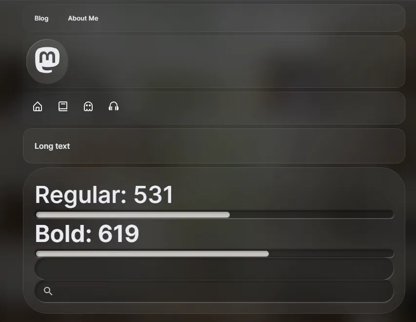
Variable Fonts
This one was pretty easy to get going using Inter and Google Fonts. Inter is an open source variable font. Variable font means you can change the weight (or “thickness”) of the font. When you see something bold on the internet, it’s usually 500 weight or heigher.
But how does that work practically?
Google Fonts lets you download a “range” of font weights at once. So you could get a variable font and limit the weight between 400 and 700. In my case I want it all, so I go from 100 to 900.
import React from "react";

type Props = {};

const Fonts = (props: Props) => {
  return (
    <>
      <link rel="preconnect" href="https://fonts.googleapis.com" />
      <link
        rel="preconnect"
        href="https://fonts.gstatic.com"
        crossOrigin="anonymous"
      />
      <link
        href="https://fonts.googleapis.com/css2?family=Inter:wght@100..900&family=Roboto+Mono&display=swap"
        rel="stylesheet"
      />
    </>
  );
};

export default Fonts;
Now that we have all the font files loaded, we can use the font and change it’s weight as much as we want. To change the weight of a variable font, we need to use the font-variation-settings property. We can pass it a property type like wght for font weight, or wdth for font width if the font supports it. And then the value of we want it to be.
In my case, I set this up to be a Styled Components theme property.
export const FONT_WEIGHTS = {
  regular: 420,
  bold: 710,
};
Then inside my <Text /> component I could grab it, store it inside a CSS variable (just cause), and use the fontVariationSettings property to set the weight with it.
import { Theme } from "@theme/index";
import styled from "styled-components";
import {
  ColorProps,
  MarginProps,
  TypographyProps,
  color,
  typography,
  margin,
} from "styled-system";

export type TextProps<ElementType = HTMLParagraphElement> = ColorProps &
  TypographyProps &
  MarginProps &
  React.HTMLAttributes<ElementType> & {
    as?: string;
    for?: string;
    fontWeight?: keyof Theme["fontWeights"];
    display?: React.CSSProperties["display"];
  };

const Text = styled("p")<TextProps>(
  // @ts-ignore
  {
    boxSizing: "border-box",
    margin: 0,
    "--wght": ({ fontWeight, theme }) => theme.fontWeights[fontWeight],
    fontVariationSettings: `"wght" var(--wght)`,
    display: ({ display }) => display,
  },
  color,
  typography,
  margin,
  {
    color: ({ theme }) => theme.modal && theme.colors.textOverlay,
  }
);

Text.defaultProps = {
  color: "text",
  fontSize: 2,
  fontWeight: "regular",
  lineHeight: 4,
  fontFamily: "body",
  display: "initial",
};

export default Text;
Now we just needed a place to toggle the weight. I created a modal for all the customization settings and added a slider in there for the font weight.

Focus Navigation
I’ll touch on this in a future blog, but I also implemented focus navigation. My goal was to make the site function like a native app on a console or TV — navigable by gamepad or mouse/keyboard as backup.
I started off using Norigin’s Spatial Navigation library. This is a solid solution to quickly create a focus library on the web. But it doesn’t support gamepads and other devices, and they don’t ever have plans to. And it’s actually impossible to wire it up effectively without altering their library.
So I created my own — react-unified-input. It’s lets you add focus navigation to your app, very similar to Norigin’s solution, but I ensure that multiple input devices are supported at once (currently only keyboard and gamepad, but more could be added).
Here’s an example of the site’s navigation with focus enabled, and a debug view to see the focus (with blue borders).

This is currently still being tested out a bit before I make it live on the website. But you’ll definitely see it soon 👀
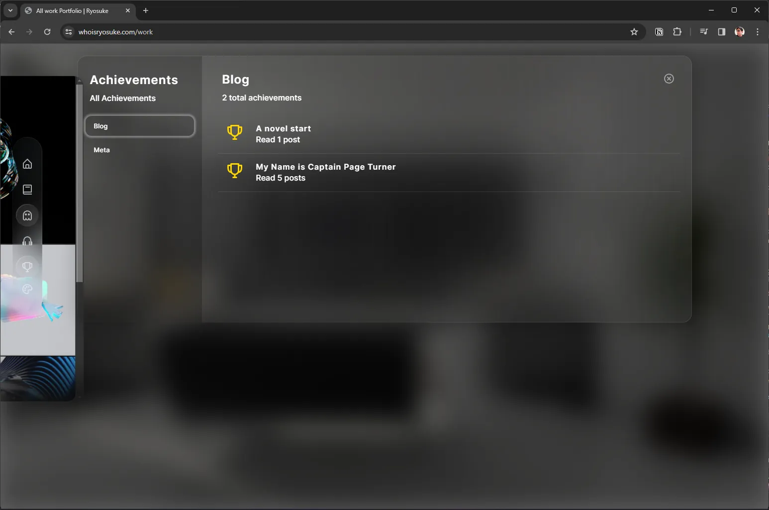
Achievements
One of the key aspects of my website I wanted to embrace was gamification. I wanted to encourage users to use the website and reward them for completing successful flows (like reading blog posts).
Notifications (aka “Toasts”)
To enable achievements, I needed to implement a notification system. These “toasts” would popup when an achievement was popped, and let the user know they got it.
As with most things on this site, I wanted to create it from scratch to practice my skills.
The notifications are a 3 part system:
- A Zustand data store. This contains all the notifications and lets us trigger them from anywhere in app.
- Manager component. We need a component to display the notifications. This also handles removing notifications once enough time has passed.
- Notification component. Finally we have a component for the notification itself. Nothing fancy here, just styling.
First I created the types for a notification (aka “toast”) and the Zustand store to manage it.
export type ToastStatus = "show" | "hide";
export type ToastTypes = "general" | "achievement";

export type Toast = {
  content: {
    title: string;
    message: string;
    icon?: ToastIconNames;
  };
  // Time toast was emitted
  time: number;
  status: ToastStatus;
  type: ToastTypes;
};
Here’s the manager component. The notifications are deleted in the useEffect() with a setTimeout. We have a removeQueue that keeps track of what notifications we’ve marked to delete - that way when we loop over the notifications we don’t add a timeout twice.
const TOAST_DURATION = 3000;
const TOAST_EXIT_DURATION = 1000;

const ToastManager = (props: Props) => {
  const { toasts, removeToast, updateToast } = useToastStore();
  const removeQueue = useRef({});

  const toastMap = Object.values(toasts);

  useEffect(() => {
    toastMap.forEach((toast) => {
      // New toast? Set a timer to hide it.
      if (!(toast.time in removeQueue.current)) {
        // Mark for deletion
        removeQueue.current[toast.time] = setTimeout(() => {
          removeToast(toast.time);
          delete removeQueue.current[toast.time];
        }, TOAST_DURATION);
      }
    });
  }, [toasts]);

  // The return statement here
};

export default ToastManager;
Achievements
Now that I have notifications, we can create achievements. But what do we need? A list of achievements, a store to track the user’s achievements, a way to trigger achievements, and a place to see the achievements.
I started by creating the Achievement types. I was able to extend the notification type since achievements are basically just notifications. And I created a AchievementLog type to keep track of what achievement the user unlocked and when.
// Achievements are basically toasts. We attach extra props for the Achievements page.
export type AchievementDetails = Toast["content"] & {
  hint?: string;
};
export type AchievementCategory = Record<string, AchievementDetails>;

// Achievement Categories
const BLOG_ACHIEVEMENTS = {
  READ_1: {
    title: "A novel start",
    message: "Read 1 post",
  },
  READ_5: {
    title: "My Name is Captain Page Turner",
    message: "Read 5 posts",
  },
};

// We create a type with all the achievment IDs
// aka the object keys from above
export type AchievementId =
  | keyof typeof BLOG_ACHIEVEMENTS
  | keyof typeof META_ACHIEVEMENTS;

// For the Zustand store to track unlocked achievements
export type AchievementLog = {
  id: AchievementId;
  date: number;
};
Then I popped over the Zustand app store and added some functionality to add an achievement to the user’s collection.
We keep a property called achievementData that keeps track of achievement data — like the number of blog posts read in total by the user. This allows us to check if they’ve read 1 or 5 blog posts.
// Achievement Data Store
export type AchievementData = {
  blogsRead: number;
};

// Achievements
achievementNotification: boolean;
achievementsLog: AchievementLog[];
achievementData: AchievementData;
updateAchievementData: (achievementData: Partial<AchievementData>) => void;
addAchievement: (achievement: AchievementLog) => void;
toggleAchivementNotifications: (status?: boolean) => void;
Now we can trigger achievements. The first type I handled was reading blog posts. I created a hook that I added to the blog post page.
When the hook runs, it checks if it’s run already using a loaded state, then it checks the achievementData in the store to check how many posts the user has actually read, and finally increments it and updates the store. If the user reaches the required number of posts, it triggers the achievement.
const useBlogPostRead = () => {
  const [loaded, setLoaded] = useState(false);
  const {
    achievementNotification,
    addAchievement,
    achievementData,
    updateAchievementData,
  } = useAppStore();
  const { addToast } = useToastStore();

  useEffect(() => {
    const blogReadAchievement = (id: AchievementId) => {
      addAchievement({
        id,
        date: new Date().getTime(),
      });
    };

    // Only mark as read once
    if (!loaded) {
      // console.log("[ACHIEVEMENT] Blog post read", achievementData.blogsRead);
      // Update the achievement data store
      const blogsRead = achievementData.blogsRead + 1;
      updateAchievementData({
        blogsRead,
      });

      // Check what number blog post this is and award appropriate achievement
      let key;
      switch (blogsRead) {
        case 1:
          key = "READ_1";
          break;
        case 5:
          key = "READ_5";
          break;
      }
      // console.log("[ACHIEVEMENT] Blog post read added", blogsRead);

      if (key) {
        // console.log("[ACHIEVEMENT] Found a key", key);
        // Save achievement to data store
        blogReadAchievement(key);

        if (achievementNotification) {
          // Send out a notification toast about it
          const toast = createAchievementToast({
            ...ACHIEVEMENT_LIST.blog[key],
            icon: "",
          });
          addToast(toast);
        }
      }

      // Set blog post as loaded so this won't run again until new page load
      setLoaded(true);
    }
  }, [loaded]);
};
📁 To scale I’d prob swap the switch statement with a loop over the actual achievements themselves since they have the requirement baked in (rather than rewriting each key in a switch statement).
Now that the achievement exists, we need a place to keep track of it once the notification disappears.
I created another modal specifically for achievements and added tabs for each category. Again, nothing too fancy here.
Blog
One of the key areas I focused a lot of energy on was the blog. I wanted the experience to feel as empowered and seamless as possible.
After watching the Vision Pro UI breakdown video, I thought the Safari web browser would be the perfect app to house my blog. It gave it a proper place to display long form, scrollable content. And the UI of the browser itself would be fun to work with and provide the user extra levels of interactivity.

Let’s break it down a bit and see all the cool stuff that went into it.
“Safari app”
Framing the blog inside the Safari app was actually pretty fun. It gave me the URL bar with all the buttons to work with. And it made the blog content look much more “native” than if it were just a random floating glass panel.
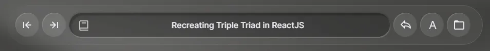
The URL bar became a place for the blog title, so it could follow the user along as they scroll past the larger <h1> at the top. Then the back and forward buttons work exactly like you’d expect, they navigate forward and back through browser history, and ideally through blog posts if you’ve been navigating between them.
There’s also a share button that pops up the native share menu. And I wanted a quick button for the user to be able to access the blog’s theme customizer. And finally I threw in a button to bring the user back to the blog archive (just to keep their mouse in the scope of the “app” — instead of clicking back on the blog button in main navigation).
High Contrast Mode
One of the issues I immediately noticed when working with the Vision Pro design system was legibility of content. It was difficult, even when allowing the users to change the font weight, to guarantee that all users would be able to comfortably read the site content (particularly the long form blog writing).
The way Apple handles this is simply 2 ways: a better rendering engine than my CSS implementation. That allows them to get better blurring of the background and high contrast glass containers — and clearer text. And second, they’re in AR/VR where arguably text is harder to read — but users have the benefit of being able to pull the UI closer or farther. User’s on my site could increase the font size using the native browser zooming, but I still wasn’t happy with the look of it.

So I created a “high contrast” mode for the blog. The user can enable this in the theme customization modal (or click the button on the blog page). It takes the glass and makes it completely white and opaque, and make the text black. I wanted this to feel like the reader mode in Safari where you could really strip away a lot of the styling and just read.
Page Transitions
I wanted the blog to look as smooth as possible when users were navigating inside it. Since the blog was an “app” that looked like Safari, I didn’t want the page to reload and shuffle stuff about and disrupt the experience.
So I took advantage of NextJS’ _app.js route to wrap every page in the website with a consistent layout. This way, when they navigate, only the page content changes — not the layout around it. I added a transition animation using framer-motion’s <AnimatePresence> component that basically fades and slides the page in.
// _app.tsx
<Page>
  <AnimatePresence>{content}</AnimatePresence>
</Page>
But like I mentioned earlier, I didn’t want the “Safari app” to look like it was fading in every time — so I added a conditional check on the _app.js page to wrap the page in a <BlogPage> wrapper as well. This lets the user navigate through blog posts without the surrounding “app” to appear like it’s reloading.
const content = isBlog ? (
  <BlogPage title="">
    <Component key={key} {...pageProps} />
  </BlogPage>
) : (
  <Component key={key} {...pageProps} />
);
And that worked really well!
Portfolio
The last iteration of my website didn’t have a portfolio because I didn’t feel like putting on together, and most of my work at the time was under NDA. But since then I’ve been busy making 3D art and animations, and I wanted a place to share that and other cooler prototypes I’ve created (like all the MIDI and game dev ones).
I started with a really basic masonry layout with cards for each work. Videos would autoplay inside the card. It was cool, but it felt a little flat and boring. It was exactly what I was trying to avoid with the blog — content looking boring inside a glass container.
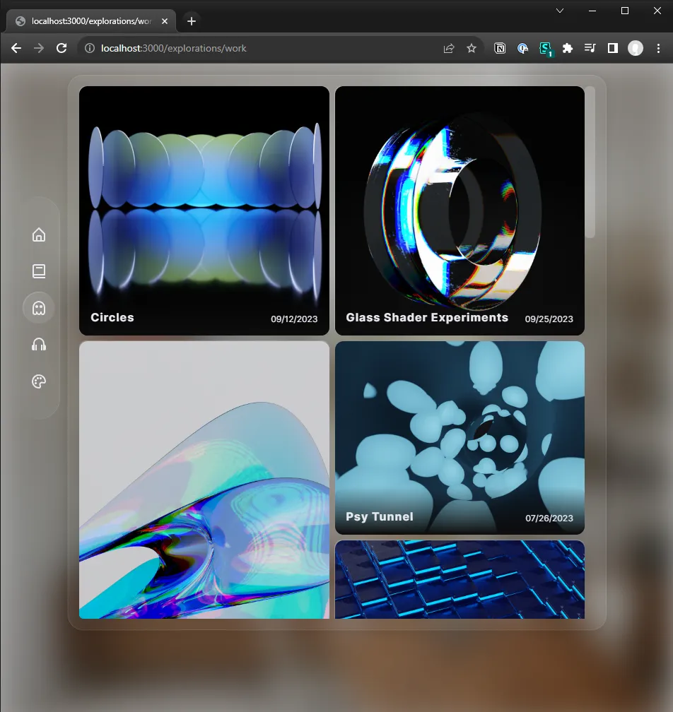
So the next iterations broke outside the glass and made each work of art a panel itself in space. I kept the masonry layout, but I shifted it into 3D space. This worked well actually, and would have been the implementation I settled with - if I didn’t discover a browser-specific bug that broke the effect completely.
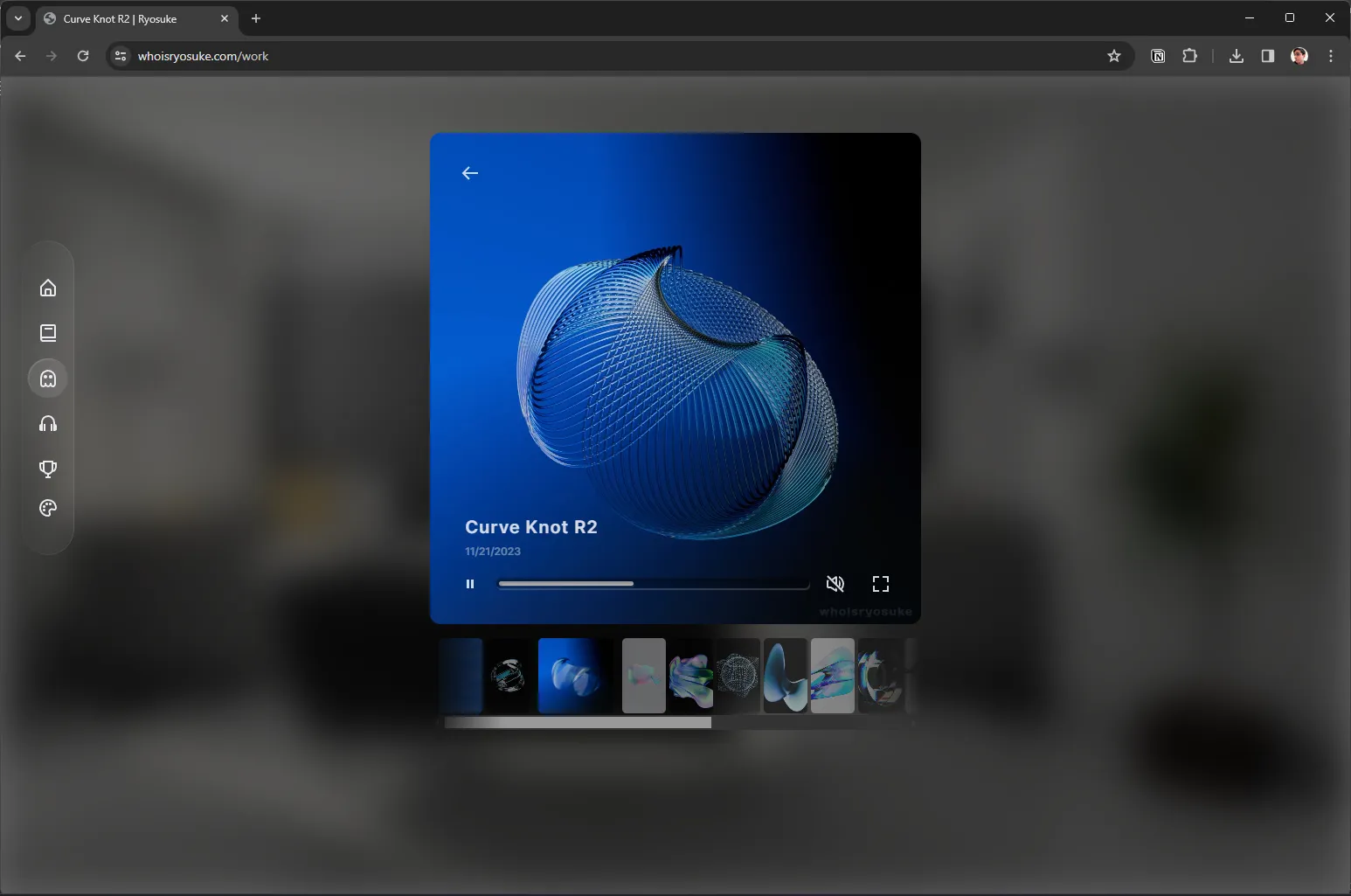
Finally I was hit with the solution — the Vision Pro photo app. Apple has done a significant amount of work figuring out how to display photos and video in 3D — why not take a few notes from there?
I created a main “archive” type page with all the images in this masonry-inspired grid.

Then clicking each image fades the app away and fades in a more concise “single” view with a slider of thumbnails underneath for navigating. This component was fun to create, it renders images or videos. And for the videos gives you nice native looking video controls.
📁 After testing this out a bit with a few videos, my bandwidth on Netlify hits about 20% capacity each month now (vs like…1-5% before). I looked into integrating a CDN with NextJS, but the price of a CDN alone is pretty prohibitory — so I’ll be looking into solutions in the future for optimizing the videos. And ideally, figuring out a CDN solution that will last for a long time.
The music app
I always try to infuse a piece of myself into every site. One of the best ways I find to connect to others is through music. It felt like a no brainer to bring back the Playlist page from my previous website - but this time in the form of the Vision Pro Music app. It’d be another opportunity to replicate some of Apple’s UI and take some notes - and have some fun in the process.
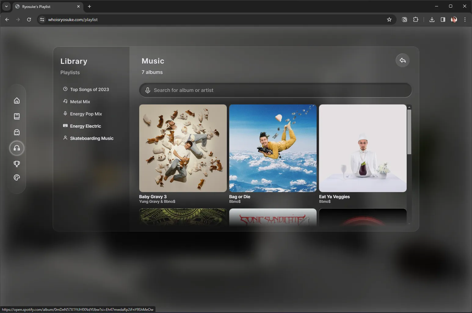
I added some of my favorite albums from this year, and of all time, and linked them up to Spotify so you can quickly listen. I also included a list of playlists on Spotify on the left side.
Is 3D the future?
I think it’s an inevitable part of UI that is only limited by our current rendering platforms. As we see more platforms like Vision Pro embrace 3D-first UI, we’ll start to come closer to future of interfaces.
Is it feasible now on the web? Totally. But it’d require rebuilding a website from the ground up on a WebGL or WebGPU based pipeline, instead of relying on the DOM and CSS. Both are very powerful and can do a lot of 3D features as I’ve exhibited. But ultimately these take place in a 2D space, limited by the user’s device screen. Until the native CSS and DOM supports AR, we’ll see other graphics libraries filling in the gap.
The entire time I built this site, I considered just building it in an AR framework like AFrame or ThreeJS, which would let users experience the 3D in actual 3D space, and immerse them in the content similarly to Apple. Though since this is my personal site and blog, I want it to be seen and experienced by as many people possible. So I opted to keep it CSS, and support users across most devices from desktop to mobile. And to “progressively enhance” the site to support both would have been a huge time sink, having to rebuild many systems for the 3D frameworks.
3D is definitely something I’m looking forward to and exploring. I’ll continue exploring a lot of these concepts in a custom graphics renderer, since it seems more likely that WebGPU will release faster than proper AR/VR support for the DOM.
Did you find any of this interesting? Got questions? Feel free to hit me up on Threads, Mastodon, or Twitter.
Stay curious, Ryo