As I’ve been learning Rust, I find it best to make apps and tools that are useful to me. One of my favorite concepts or paradigms I integrate into every project: utility style props. Whether it’s Styled System or Vanilla Extract, my app’s components will be connected to a strict theme with convenient props like mt for marginTop.
But what would this look like in Rust? I spent some time researching and exploring a few different solutions to the problem. It took a bit of adapting to Rust’s strict rules (compared to the loosest language - JS). I thought I’d share my findings for anyone looking to include more Rust in their frontend stack.
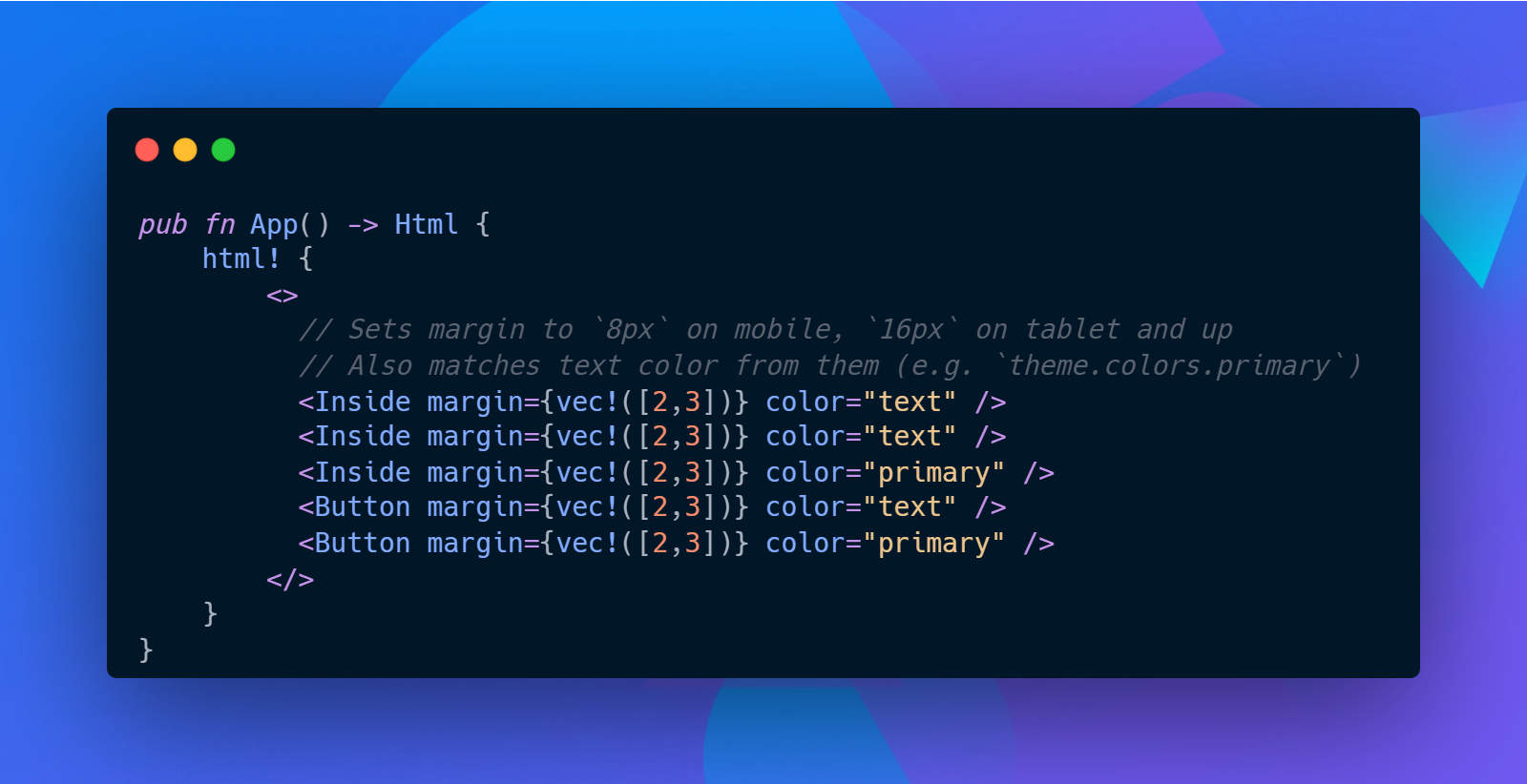 Code snippet showing a Yew app and a few components using utility style props to apply themed colors
You can find the full code here on Github - make sure to check out the different branches.
What are utility style props?
Before I dive too deep, let me do a quick introduction into the concept of utility style props.
Utility style props are a system of linking component props to a “theme” (or a set of design tokens). Normally apps have a design system with a set number of design tokens, like colors (e.g. color.blue.700). You can see these tokens in apps like Figma (with “styles”). They normally get interpreted into code, from CSS variables (e.g. --color-blue-700) or JSON.
Here’s an example of a JSON theme, structured using the System UI specification. We’d access color tokens by using JavaScripts object syntax (theme.colors.primary).
export const theme = {
  animation: {
    default: "400ms ease-in",
    fast: "300ms ease-in",
  },

  colors: {
    text: "#111212",
    background: "#fff",
    primary: "#005CDD",
    secondary: "#6D59F0",
    muted: "#f6f6f9",
    gray: "#D3D7DA",
    highlight: "hsla(205, 100%, 40%, 0.125)",
    white: "#FFF",
    black: "#111212",
  },

  // Sizing scale
  // Integers are converted to px
  space: [0, 4, 8, 16, 32, 64, 128, 256, 512],
};
Let’s take a look at a component with utility style props (React in this case, but could be any similar framework):
<Button margin={2} color="primary" padding={[2, 3]} />
Let’s break down the component props:
marginis set to2, which corresponds to the third value in thespacearray in our theme (8in this case).coloris set toprimary, which corresponds to thecolorssection of the theme.paddingis set to[2,3]. This array syntax lets us define different padding properties for specific breakpoints. In this case, the padding would be8on mobile, and16on tablets and up. This shorthand syntax is really useful when composing responsive layouts. Learn more here.
With those short props we’re able to generate the following CSS:
.button {
	margin: 8px;
	color: #005CDD;
}

@media screen and (min-width:480px) {
	padding: 8px;
}

@media screen and (min-width:600px) {
	padding: 16px;
}
As you can see, the component props are strictly tied to theme values, making it much easier to stay within the guidelines of the design system. You can also include other values usually, in case you have one-off designs that require styles outside the available theme/tokens.
I highly recommend checking out Chakra UI, it’s a React component library that uses it’s own version of Styled System to create utility style props.
How would it work in Rust?
There are three ways this technique works in JavaScript.
- You either use a CSS in JS library like Styled Components or Emotion to generate your CSS dynamically. This leverages the JSON / JavaScript object based theme available to all components through “context”.
- You can use a build system (Webpack, Vite, etc) based solution like Vanilla Extract. This leverages build systems and custom file extensions to parse
.css.tsfiles into CSS. - You can use a pre-compiled CSS solution like Tailwind. This requires integration with PostCSS to strip away unused styles in code, and mapping styles to the existing Tailwind classnames.
So how do we approach this problem in Rust?
First, let’s define our environment. We’ll be using a Rust-based frontend framework so we can ship an app to the web using WASM, and build it using components. There are a couple of frameworks that do this currently: Yew, Leptos, Sycamore, and Percy.
For this experiment I’ll be focusing on Yew, which is one of the most mature frameworks out there (currently around ~26k stars). It supports CSS (and SCSS I think), as well as third party styling libraries like Stylist RS (aka Styled Components for Rust). That combined with the versatility of Rust, we should be fine.
Setting up our playground
I cloned this project as the basis, it’s a template for creating a Yew app using Trunk to build and serve the WASM. Then I installed Stylist RS and used the yew-theme-context example to add a Theme struct to my Yew app.
Now we can start to approach the problem 🏃♂️💨
The Attempts
Vanilla Extract style
I’ve recently been digging the Vanilla Extract styling library and how it handles “sprinkles” or it’s version of utility styles. It takes a configuration up front and generates CSS for each property you define. So it basically generates a Tailwind-style atomic CSS structure. Then it also lets you integrate the style options with your component props to easily access the generated CSS class names.
I realized very quickly how difficult this would be in Yew without the luxury of a build system like Webpack or Vite. I would need to load my styles (like Vanilla Extract’s .css.ts files), parse them into CSS, then append the CSS to the page (or output it as actual CSS files and load those in the HTML as needed). And do all of that in a WASM world.
This would require a deep dive into Yew’s architecture, WASM methods for things like file handling, and Trunk’s architecture for loading assets. It was a lot up front. So I opted to explore Stylist RS instead, since it would produce a quicker MVP/POC.
Convert JSON to struct
The first thought I had was to convert a System UI spec theme written in JSON to a Rust struct. I started to manually convert it, but I quickly discovered how strict this was (and verbose). I didn’t want to expect a user coming from another platform (like Figma or JavaScript) to manually convert this.
{
  "colors": {
    "text": "#111212",
    "background": "#fff",
    "primary": "#005CDD",
    "secondary": "#6D59F0",
    "muted": "#f6f6f9",
    "gray": "#D3D7DA",
    "highlight": "hsla(205, 100%, 40%, 0.125)",
    "white": "#FFF",
    "black": "#111212"
  },
  "fontSizes": [12, 14, 16, 20, 24, 32]
}
Then I found json-to-rust-serde and quicktype. These two libraries were able to do exactly what I needed. I used the json-to-rust-serde online playground to quickly convert my theme and copied it into my app.
use serde_derive::Deserialize;
use serde_derive::Serialize;

#[derive(Default, Debug, Clone, PartialEq, Serialize, Deserialize)]
#[serde(rename_all = "camelCase")]
pub struct Root {
    pub colors: Colors,
    pub font_sizes: Vec<i64>,
}

#[derive(Default, Debug, Clone, PartialEq, Serialize, Deserialize)]
#[serde(rename_all = "camelCase")]
pub struct Colors {
    pub text: String,
    pub background: String,
    pub primary: String,
    pub secondary: String,
    pub muted: String,
    pub gray: String,
    pub highlight: String,
    pub white: String,
    pub black: String,
}
Once I imported this struct into the app I immediately noticed two major problems with this approach:
- It doesn’t scale. There’s no way for me to create a library that accepts a dynamic theme without knowing the exact type first. If the user deviates from the “default” theme structure at all the library wouldn’t be able to load the data - let alone parse it.
- It doesn’t work for our solution. You could be this explicit with your theme, but without a way to access the
structfields dynamically, you can’t write props like<Button color="primary">. It ends up looking like<Button color={theme.colors.primary} />— which works, but makes the user do extra work by importing the theme context in the parent component (of the<Button>in this case).
Here’s what our component ends up looking like. You can see that our color prop has to have String type, since we can’t use the Colors struct from our theme, and Rust doesn’t have a keysof operator like Typescript. This means no checks if our props are using real theme properties.
#[derive(Debug, Properties, PartialEq)]
pub struct Props {
		// Doesn't actually work? You'd want `keysof` like TS - but Rust doesn't have
    // pub color: Colors,

		// Works - but no compile time checks.
    pub color: String,
}

#[styled_component]
pub fn Button(props: &Props) -> Html {
		// We pass the color prop to our utility style function
    let color = generate_color_styles(props.color.clone());

    html! {
        <button class={color.get_class_name()}>
            {"The quick brown fox jumps over the lazy dog"}
        </button>
    }
}

pub fn App() -> Html {
	// Requires the parent component to have access to theme.
	let theme = use_theme();
	html! {
		<Button color={theme.colors.primary} />
	}
}

pub(crate) fn generate_color_styles(theme: &Theme, color: String) -> Style {
    let class = style!(
        r#"
            color: ${color};
        "#,
        color = color
    )
    .expect("Failed to mount style");

    class
}
This process is very reminiscent of using theme context in React Native. You’d normally have your design tokens stored inside React context, which gets access by components, then used in a StyleSheet during runtime to generate the “CSS”.
This process worked — but ended up being too explicit, especially if I wanted write a 3rd party library around it.
HashMaps to the rescue
The problem with struct is that it’s too strict (see what I did there?). What if we defined a top-level theme structure that made sense for everyone, then left areas “dynamic”, like the colors. We’d adopt the System UI structure as strict as possible (like using an vector of integers for space) — but for colors we’d use a HashMap.
The HashMap lets us do a couple of things. It lets the user define their data structure. And it lets us “query” the HashMap for the “key” we need. The only problem? We lose autocomplete for that portion of the theme, and it requires us to check for non-existent values and provide a backup so the app doesn’t crash.
Let’s change the theme to use HashMap for color:
static LIGHT_THEME: Lazy<Theme> = Lazy::new(|| {
  let mut colors = HashMap::new();
  colors.insert("text".to_string(), "#111212".to_string());
  colors.insert("background".to_string(), "#fff".to_string());
  colors.insert("primary".to_string(), "#005CDD".to_string());
  colors.insert("secondary".to_string(), "#6D59F0".to_string());
  colors.insert("muted".to_string(), "#f6f6f9".to_string());
  colors.insert("gray".to_string(), "#D3D7DA".to_string());
  colors.insert(
      "highlight".to_string(),
      "hsla(205, 100%, 40%, 0.125)".to_string(),
  );
  colors.insert("white".to_string(), "#FFF".to_string());
  colors.insert("black".to_string(), "#111212".to_string());
  Theme {
      font_color: "black".to_string(),
      background_color: "rgb(237, 244, 255)".to_string(),
      paper_color: "white".to_string(),
      space: vec![0, 4, 8, 16, 32, 64, 128, 256, 512],
      colors,
      media_queries: generate_media_queries(),
  }
});
Our component doesn’t change much. We grab the theme using Yew’s context, then pass that into the utility style function with our color prop.
#[styled_component]
pub fn Button(props: &Props) -> Html {
    let theme = use_theme();

    let color = generate_color_styles(theme.kind().current(), props.color.clone());

    html! {
        <button class={color.get_class_name()}>
            {"The quick brown fox jumps over the lazy dog"}
        </button>
    }
}
In the utility style function, we can check if the theme even has that color using the contains_key() method from HashMap. And once we confirm it exists, we can grab and clone it from the theme. Then we finally create the CSS using the style!() macro from Stylist.
pub(crate) fn generate_color_styles(theme: &Theme, color_key: String) -> Style {
    let color = if theme.colors.contains_key(&color_key) {
        theme
            .colors
            .get(&color_key)
            .expect("Couldn't find key")
            .clone()
    } else {
        "#000".to_string()
    };

    let style = style!(
        r#"
            color: ${color};
        "#,
        color = color
    )
    .expect("Failed to mount style");

    style
}
This works well too, despite the caveats.
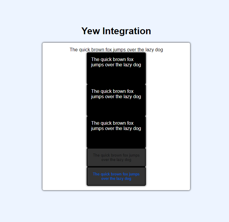 Screenshot of the Yew app showing 5 components stacked. Each has a text color applied from their props.
Screenshot of the Yew app showing 5 components stacked. Each has a text color applied from their props.
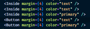 Screenshot of the 5 components in VSCode. Each has a color prop that uses a theme value like text or primary.
Screenshot of the 5 components in VSCode. Each has a color prop that uses a theme value like text or primary.
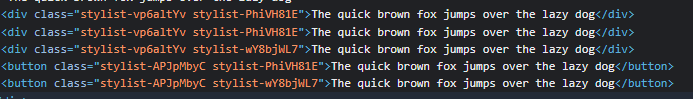 A screenshot of the rendered HTML from the Yew app and it’s 5 components. You can see 2 CSS class names per component, representing the component’s base class and the utility style we applied.
A screenshot of the rendered HTML from the Yew app and it’s 5 components. You can see 2 CSS class names per component, representing the component’s base class and the utility style we applied.
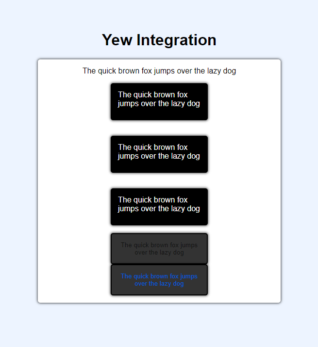
Handling breakpoints
Now that I had a couple of methods proofed out, I wanted to build off of them and add responsiveness to the mix. Rather than just writing <Button margin={2}> , the user should be able to write <Button margin={[2,3]}> to define a margin for different breakpoints.
This is where I really started to see the limitations of Rust — or rather, the endless rabbit hole of generic data types, traits, and lifetimes I’d have to sink into to get this to work properly.
The first problem: how do you define a function that accepts both a single type (String) and an “array” of types (Vec<String>)? In Rust there’s no concept of overloading, or defining multiple functions with the same name and different function parameters (so you could use the same function name to convert an integer and a float). In Rust, you’d have to define a separate function and know to use the right one based on the type. Or you could use a generic data type (aka T) and a where clause to match it to the right Trait (which looks like chicken type soup for the soul).
I decided to take the easy way out and force every prop be an array (or really, vector). This means you’d have to write <Button margin={vec!(2)}> in the most minimal case. Kinda annoying, but much easier than the alternative.
This made the utility style function fairly simple to implement, I changed the prop (or values here) to be a Vec<> and loop over it using iter(). We use enumerate() to give us indices (0, 1, 2, etc) so we can access the corresponding breakpoint in our theme. Then we create the style and nest it inside a media query (based on our theme’s breakpoint).
pub(crate) fn generateResponsiveStyles(theme: &Theme, values: Vec<usize>) -> String {
    let mut styles: Vec<String> = Vec::new();

    for (index, key) in values.iter().enumerate() {
        // Check if we even need to print the style based on current breakpoint1
        let margin = if theme.space.len() >= *key {
            theme.space[*key]
        } else {
            0
        };

        let css_property = "margin-top: ${margin}px;";

        let css_property = style!(
            r#"
            @media screen and (min-width: ${breakpoint}) {
                margin: ${margin}px;
            }
        "#,
            margin = margin,
            breakpoint = theme.media_queries[index]
        )
        .expect("");

        styles.push(css_property.get_class_name().to_string());
    }

    let combined_styles = styles.join(" ");

    combined_styles
}
Make sure to add the media queries / breakpoints to the theme:
static DARK_THEME: Lazy<Theme> = Lazy::new(|| {
    Theme {
        media_queries: generate_media_queries(),
    }
});

const BREAKPOINTS: [&str; 5] = [
    "320px",  // mobile
    "768px",  // tablet
    "992px",  // computer
    "1200px", // desktop
    "1920px", // widescreen
];

fn generate_media_queries() -> MediaQueriesArray {
    [
        BREAKPOINTS[0].to_string(),
        BREAKPOINTS[1].to_string(),
        BREAKPOINTS[2].to_string(),
        BREAKPOINTS[3].to_string(),
        BREAKPOINTS[4].to_string(),
    ]
}
 A screenshot of the Yew app showing 3 components spaced out using the margin prop.
A screenshot of the Yew app showing 3 components spaced out using the margin prop.
 Screenshot of the Chrome DevTools CSS tab showing the two CSS classes applied to a component, both are margin properties wrapped in different media queries for 320 and 768 pixel width viewports.
Screenshot of the Chrome DevTools CSS tab showing the two CSS classes applied to a component, both are margin properties wrapped in different media queries for 320 and 768 pixel width viewports.
This also works pretty well, but again, highlights some limitations of this kind of API. Our style function works for a margin, which uses integers, but what if we wanted to use it for our colors too?
We’d need a function that supports strings - not integers, and it’s need to do the same thing basically (reach into theme, grab right value, and generate CSS). This means we need at least 2 functions for generating utility styles (generate_integer_props() and generate_string_props()) that the user would have to use in their components appropriately.
Ideally you’d want to use a generic data type and where clause to define the difference between props — but it doesn’t work because it uses Traits not primitive types.
// ⛔ This won't work since `where` uses Traits - not primitive types
fn generate_props<T>() -> T
where
    T: Vec<String>,
{
    // Generate styles
}

fn generate_props<T>() -> T
where
    T: Vec<f32>,
{
    // Generate styles
}
This is where I kinda started to tap out because of the multitude of problems I started discovering. I figured I’d need to completely re-approach the problem (likely using Traits). But it was nice to see what was possible and wrap my head around Rust a bit more.
Limitations
I wanted to touch on the “limitations” that I discovered to implementing utility style props in Rust versus a less strict language like JavaScript.
Rust Strict Type System
The major limitation is Rust’s strict type system and it’s approach to architecture (e.g. no function overloads).
struct ≠ object
The first pitfall I hit was trying to convert a JSON or JavaScript object structure to Rust’s struct format. It works, but there was no way to enforce a theme structure that was universal. Anytime you introduce a dynamic layer to the structure (e.g. using HashMap to store key/value pairs like a JS Object) this usually breaks some other feature (like autocompleting types or lint errors, since you can’t know the contents of a HashMap…).
It’s also impossible to statically define a HashMap, requiring you to have a function that goes and inserts everything one by one - not ideal for someone maintaining the theme.
let mut colors = HashMap::new();
// There's no way to "load" all this data up front into a HashMap
// You could probably create a script to read JSON and generate this...but why...
colors.insert("text".to_string(), "#f6f6f9".to_string());
colors.insert("background".to_string(), "#111212".to_string());
colors.insert("primary".to_string(), "#005CDD".to_string());
colors.insert("secondary".to_string(), "#6D59F0".to_string());
colors.insert("muted".to_string(), "#f6f6f9".to_string());
colors.insert("gray".to_string(), "#D3D7DA".to_string());
colors.insert(
    "highlight".to_string(),
    "hsla(205, 100%, 40%, 0.125)".to_string(),
);
colors.insert("white".to_string(), "#FFF".to_string());
colors.insert("black".to_string(), "#111212".to_string());
No “or” type
There’s also the issue of handling props from components. The prop could be a string, integer, or even an array of strings or integers. And ideally — the user should be able to swap between them as needed (or at least, a single type and array type — like <Button mt={2}> vs <Button mt={[2,3]}>).
In Typescript you’d just use the | operator between types. Write type Prop = string | number | string[] | number[] and call it a day. You’d have to check for the type of data during runtime, but it allows for you to create more global logic.
Rust has ways of handling this technically, like using a enum to differentiate a PropTypes::String(String) vs PropTypes::ResponsiveString(Vec<String>). But then the user would have to write something like:
<Button margin={Number(2)}> />
<Button margin={ResponsiveNumber(vec!([2,3]))} />
It’s ok, but the point of utility styles props is to be short, easy, and frictionless. This started to complicate things by requiring the user to think about the types of data they’re inputting - as well as importing the appropriate enum types.
Nested types
Themes can often take different shape depending on the design system’s needs. For example, you could have “nested” colors like blue.700 or blue.500 to differentiate shades of color.
This was a nightmare to try and implement in Rust. All types are explicit, so you’d have to define the nested types too. So that blue might look like HashMap<String, HashMap<String, String>>. You can imagine going 1 layer deeper would be an even longer and difficult to grok type.
And this also made defining functions very difficult. The same function that worked for a “single layer” HashMap wouldn’t work for a nested HashMap.
Looping over struct fields
One of the most common things you’ll find yourself doing in JavaScript is Object.keys(). This lets you access all the fields (or properties) of an object. For example:
export const colors = {
  text: "#111212",
  background: "#fff",
  primary: "#005CDD",
  secondary: "#6D59F0",
  muted: "#f6f6f9",
  gray: "#D3D7DA",
  highlight: "hsla(205, 100%, 40%, 0.125)",
  white: "#FFF",
  black: "#111212",
};
In JavaScript we could traverse all the colors in this object by doing Object.keys(colors). This gives us access to the “keys” text, primary, etc.
Let’s take a look at Rust. This is that same object as a struct.
pub struct Colors {
    pub text: String,
    pub background: String,
    pub primary: String,
    pub secondary: String,
    pub muted: String,
    pub gray: String,
    pub highlight: String,
    pub white: String,
    pub black: String,
}
Now if we want to loop over the keys in the struct we…can’t. Rust doesn’t support this natively. If you wanted to support this, you’d have to write your own function or implement a Collection trait. And it still wouldn’t support the property names (like text), only the values, since there’s no way to dynamically access a struct field (you can’t do Colors["text"] like objects in JavaScript, PHP, etc).
Yew
No autocomplete for types
In Typescript, when you type props you get an autocomplete. This won’t happen inside Yew’s html!() macros in Rust (not until someone implements it as a VSCode feature or something…)
Yew components will check props values against the prop type (struct Props) during build. So it’ll work to check for mistakes — but not useful to the end user when trying to quickly remember props.
This means you need a way to offer same functionality to user (easily finding elements). ala Colors.blue.700 somehow… Colors::Blue::700. But if the user is accessing a struct or enum (and enum's don’t work well for nested data anyway…) they’re probably doing more work than they should.
WASM
Yew compiles to WASM. This means you need to use a special WASM library to access web APIs (like the console.log() or services like gamepads). This limitation is fairly reasonable considering it’s the compromise you make for shipping Rust to a web browser.
But it definitely complicates a styling solution. I was thinking it’d be as simple as loading JSON from the disk using Rust’s std library - but it was not the case. You need to make sure the JSON file is copied to the server, load it from there (using presumably a fetch() via the Rust WASM library), and then you can do whatever you need. For someone who wanted to read a JSON file and output CSS, it became a process of jumping through hoops to make it happen.
Stylist RS
No dynamic property names
You can use variables inside your style!() macro to include dynamic properties (like literally taking your component’s margin prop and using it inside a style tag).
let css_property = style!(
  r#"
    margin: ${margin}px;
  "#,
  margin = margin,
)
.expect("");
You can even use variables for the media query / breakpoint:
let css_property = style!(
  r#"
    @media screen and (min-width: ${breakpoint}) {
        margin: ${margin}px;
    }
	"#,
  margin = margin,
  breakpoint = theme.media_queries[index]
)
.expect("");
But you can’t use a variable for a CSS property or entire style. This is because Stylist uses a DSL to “lint” the CSS on compile, which uses the exact string you pass (including the variables you pass). So the exact string in the style!() macro must be a valid CSS structure. You can see more here in this Github issue. And learn more about the style macro here in the docs.
// ⛔ This doesn't work. Stylist fails and points to our `property` variable.
let css_property = style!(
  r#"
    ${property}: ${margin}px;
	"#,
  margin = margin,
	property = "margin".to_string(),
)
.expect("");

// ⛔ Also doesn't work
let css_property = style!(
  r#"
    ${css}
	"#,
  css= "margin: 10px;".to_string(),
)
.expect("");
You’ll see this error your IDE with a CSS parsing issue:
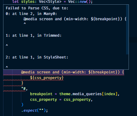 Screenshot of a tooltip in VSCode showing an error parsing CSS from the Stylist RS library.
Screenshot of a tooltip in VSCode showing an error parsing CSS from the Stylist RS library.
This meant that to write a library that targets each CSS property, I’d have to write a separate function that manually writes each property name 😵 Or fork the Stylist RS library to change the way the parser works (and let it be more forgiving - yet also more brittle lol).
CSS inheritance problems
I’m able to generate separate “atomic” CSS styles, but when you combine all the class names together the results are non-deterministic.
For example, I created a <Button> using a base CSS class with white text. I also applied another CSS class for the color prop, changing the text to “primary” (or blue). Second class name is the color prop - you can see the text one shared 3 times (just like components)
Screenshot of the Chrome DevTools showing rendered HTML and the 5 components represented as 3 divs and 2 buttons. They all share classes similar to utility props structure.
But this does highlight inheritance issues. If you have a base class for the component and apply the same property again - it sometimes works - sometimes doesn’t (see the third box and 2nd button - both have same secondary text color class, but only button’s applies).
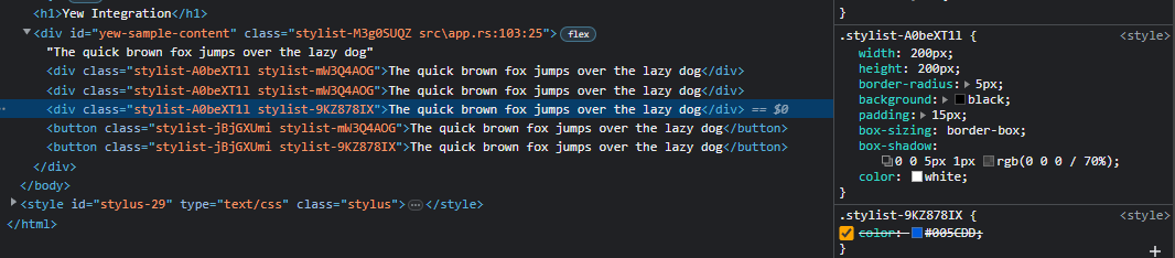 Screenshot of the Chrome DevTools showing rendered HTML and the CSS sidebar. One of the div elements is selected and the CSS styles are displayed. The second class is being overriden by the first.
Despite the class name appearing second, the base class overrides it. This would require every prop to either include a !important (bad practice) - or be wrapped inside a media query (which takes precedence over normal classes).
Final thoughts
This is definitely a project I’d approach again in the future. I’m a big fan of this styling paradigm and I think it makes frontend work much more enjoyable and easy. Bringing something similar to Rust would be pretty cool. I hope this helps you on your journey into Rust and styling.
As always, if you have any questions or want to share your own game dev work, feel free to share with me on Mastodon or Twitter.
Stay curious, Ryo